Preview image. Unlock full-res
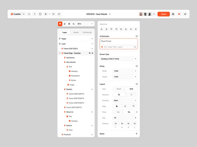
A design-tool interface with a left-side hierarchical component tree and a right-side panel for editing layout, sizing, alignment, and styling properties.
Summary
A design-system editor interface with a collapsed left-side component tree and a dense right-side property panel for configuring alignment, layout, sizing, and style rules.
Visual description
The interface features a top toolbar with the Codifier logo, a "Share" button (red), and export/play controls. A two-column layout occupies the main canvas: the left sidebar displays a hierarchical tree of components and pages (Home Page Desktop, Tab Header, Hero Section, etc.), each item marked with red square icons denoting component state. The right panel is subdivided into sections including Alignment (with align-left, align-center, align-right buttons), AI Generator (text input with red error indicator), Screen Type (dropdown showing 1440x1024), Sizing (Width and Height spinners showing 1440), Layout (Stack/Grid toggle), Direction controls, Start/End positioning buttons, Align buttons, Wrap toggle (Yes/No), Gap (16), Padding (with numerical inputs for each side), and Styles (with a plus icon for adding new styles). All text is black or gray on a light gray background.
Key takeaway
The dense, vertical property panel organization prioritizes developer ergonomics: related controls are grouped into labeled sections (Alignment, Layout, Sizing, Styles), each collapsible. Input fields (width, height, padding, gap) use spinners with clear labels. The left-side layer tree shows the component structure visually, making it easy to navigate without scrolling. The red "AI Generator" section highlights that feature, separating smart tooling from manual settings.
Reuse notes
Essential reference for design-tool and component-library UIs, no-code builders, and developer-facing configuration panels. The two-column layout scales well for complex nested hierarchies. The property-panel pattern is ideal when space is at a premium and users need rapid access to many settings. Suitable for Figma-like design systems, Webflow-style builders, or any component inspector interface. The section-based organization prevents cognitive overload when presenting dozens of controls.