Preview image. Unlock full-res
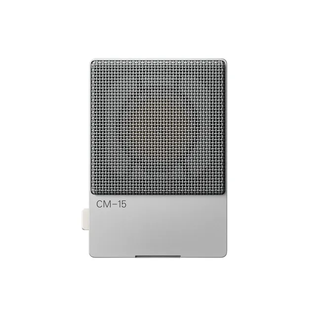
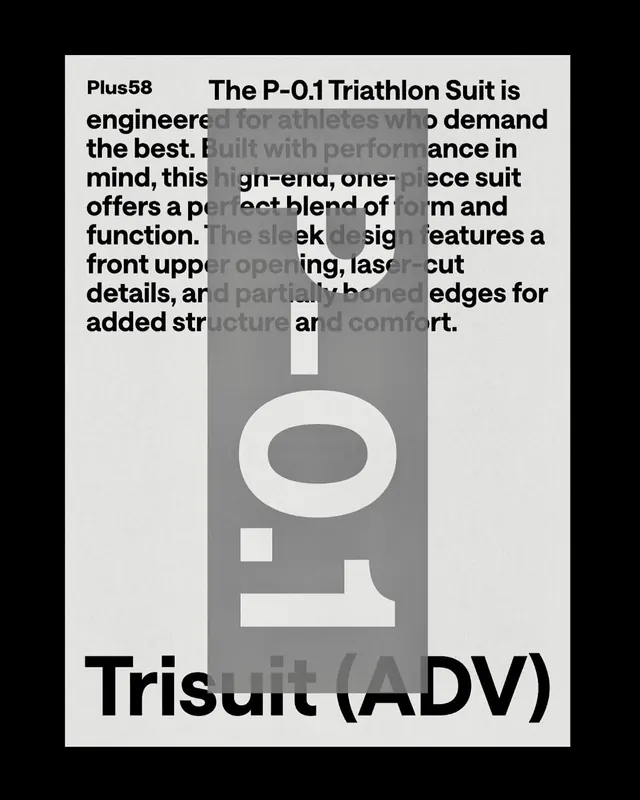
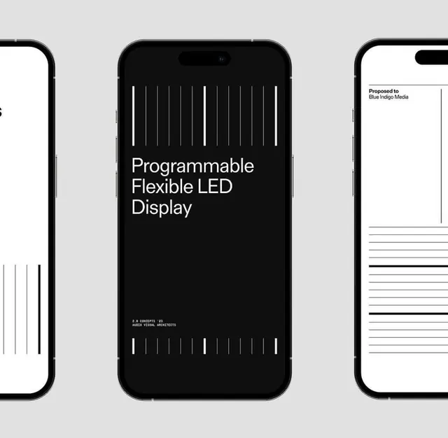
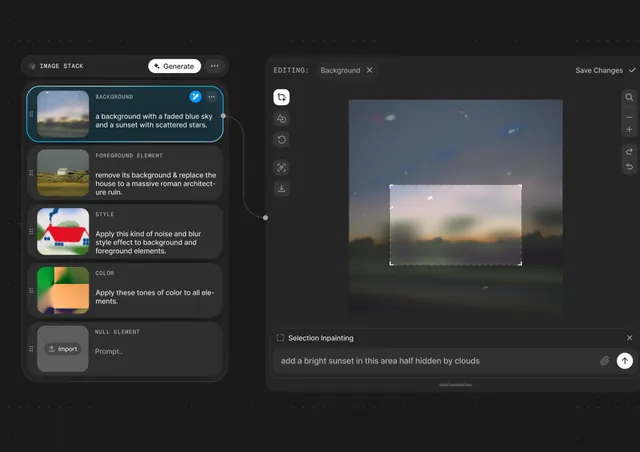
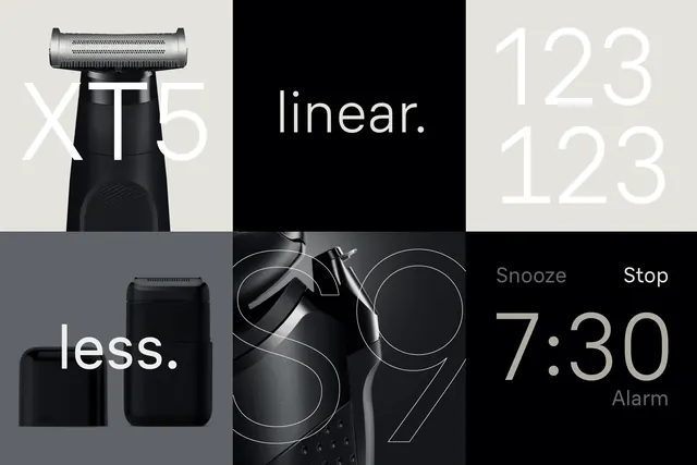
Four-quadrant grid mixing product photography (razor, earbuds) with typographic and interface details over stark monochrome palette.
Summary
A 2x2 grid combining full-product shots and macro details with typography specimens, unified by stark black, white, and grey.
Visual description
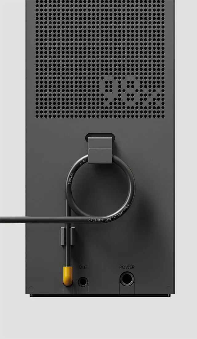
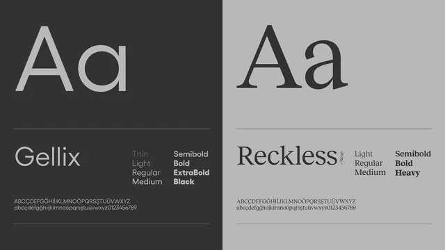
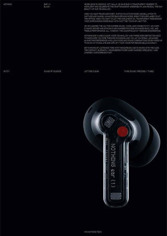
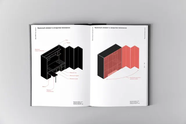
Four equal quadrants arranged in a grid: top-left shows a shaver/razor head in profile against light background with large serif "xT5" text. Top-right displays typographic specimens of the letter "Abc" in white sans-serif at three scales (100 pts) against black, bright green, and light backgrounds. Bottom-left pairs a dark box-shaped product (possibly earbuds case) with text "less." in white. Bottom-right is a highly detailed macro photograph of circular electronic components (dial, speaker grille, coil) in monochrome black and silver with minimal white text (Snooze, Stop, 7:30, Alarm). All elements are tightly cropped with no borders or padding between quadrants. Every text element is labeled with its role and specs (e.g., "CTA Buttons / Work Sans").
Key takeaway
The grid rhythm created by equal quadrants with no gutters forces each module to stand alone while the monochrome palette unifies them visually. Product photography at different scales (full form and macro detail) in the same layout tells a story about precision and material quality without any copy. Combining hard product shots with soft typography specimens in the same grid makes both sing by contrast.
Reuse notes
Effective for hardware and consumer-electronics brands aiming for premium, clinical precision. The high contrast and monochrome approach works especially well in B2B or techy contexts. Requires genuinely good product photography to avoid looking sterile; the grid leaves nowhere to hide. Scale works well on product detail pages or brand-book spreads.