Preview image. Unlock full-res
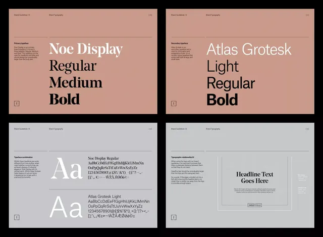
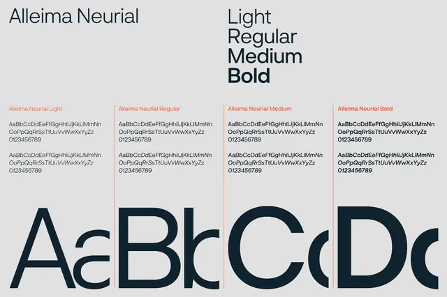
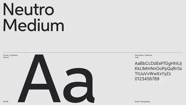
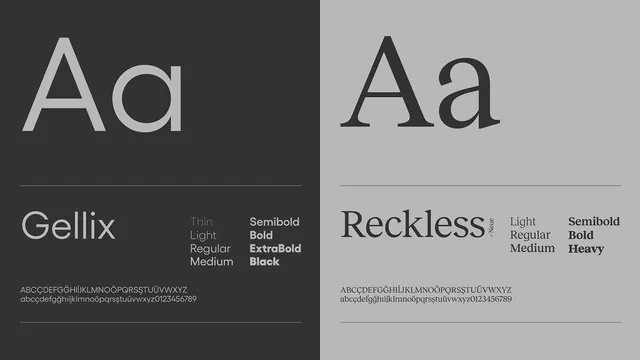
A split-screen typeface specimen comparing two sans-serif families (Gellix and Reckless) with weight variations displayed over contrasting dark and light backgrounds.
Summary
A split-screen typeface specimen displaying two geometric sans-serif families side by side, with weight progressions ranging from Thin to Heavy.
Visual description
The composition divides the canvas vertically: dark charcoal background on the left, light gray on the right. Each half showcases a typeface name in large display letters (Gellix left, Reckless right), followed by a horizontal divider line and a weight ladder listing available weights (Thin, Light, Regular, Medium, Semibold, Bold, ExtraBold, Black, Heavy). Below each weight ladder is a character set demonstrating uppercase, lowercase, and numerals. The typefaces use geometric proportions with clean, open letterforms typical of modern geometric sans-serifs.
Key takeaway
The side-by-side contrast technique: placing the same typeface family on opposing light/dark backgrounds emphasizes how weight shifts perception across tonal backgrounds. The simple enumeration of weights and character set creates a concise, professional specimen format suitable for design documentation or type-system presentations.
Reuse notes
Ideal as a reference for designing type-system documentation, font specimen layouts, or branding guidelines that feature geometric sans-serifs. The minimal treatment works well for technical or design-focused presentations. Works across design tools, development documentation, and design-system specimens.