Preview image. Unlock full-res
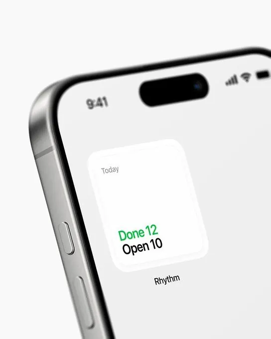
A minimalist mobile UI card is shown on an angled smartphone mockup against a white background.

Summary
A minimalist mobile UI card is shown on an angled smartphone mockup against a white background.
Visual description
An angled close-up of a smartphone fills the frame, with the left edge of the device visible and a black pill-shaped cutout at the top of the screen. In the center sits a small rounded white card that shows the word "Today" and the metrics "Done 12" in green and "Open 10" in black, with the label "Rhythm" beneath it.
Key takeaway
Use a single floating rounded card on a clean white canvas to make one metric cluster feel premium and easy to scan. Keep the hierarchy extremely small and restrained, with one accent color doing all the work.
Reuse notes
Reach for this when you want a compact status widget, habit tracker, or daily summary to feel tactile and high-end. It works best when the surrounding UI is intentionally sparse and the content is just a few numbers or labels.