Preview image. Unlock full-res
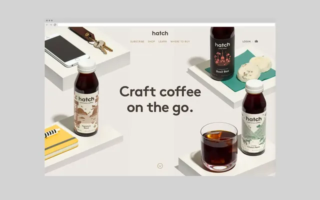
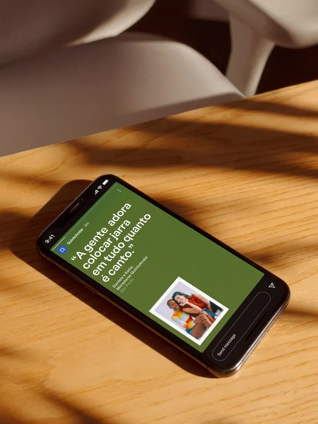
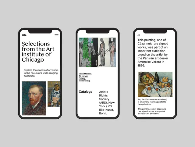
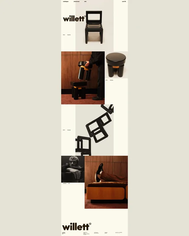
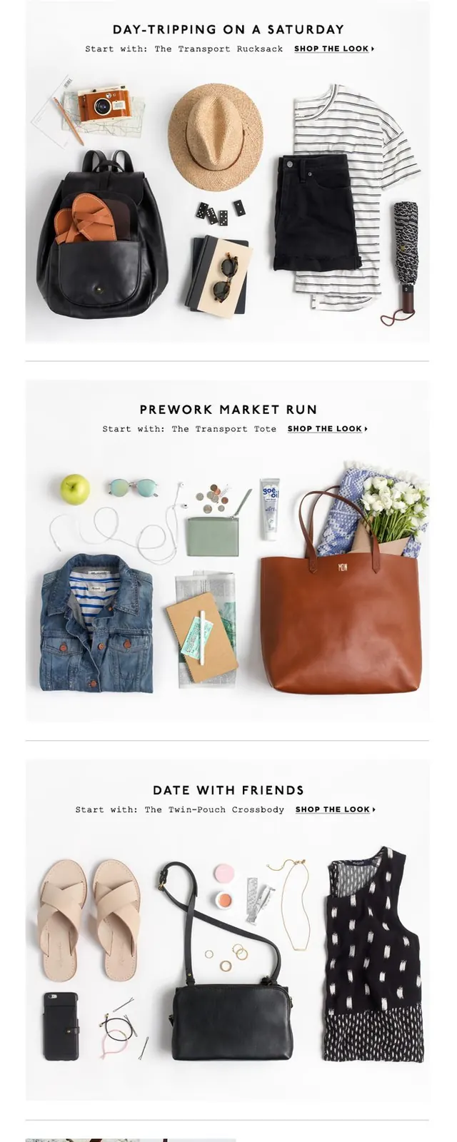
A minimalist ecommerce-style promotional landing page features a large headline, black call-to-action bars, and styled product flat-lay sections arranged vertically.
Summary
A minimalist ecommerce-style promotional landing page features a large headline, black call-to-action bars, and styled product flat-lay sections arranged vertically.
Visual description
The screen shows a white-background promotional layout with a top navigation, a bold centered hero headline, and a black shipping banner. Below are multiple vertical content blocks combining product flat-lay photos with section headings, small supporting text, and shop-the-look links, ending with a split image-and-text feature panel and social icons in the footer.
Key takeaway
Use strong typographic hierarchy with lots of white space, then break the page into editorial-style product story blocks. A single dark CTA treatment repeated across the page gives the whole layout a clean retail rhythm.
Reuse notes
Reach for this when you want ecommerce content to feel curated rather than salesy. It works best for fashion, accessories, and lifestyle brands with strong product photography.