Preview image. Unlock full-res
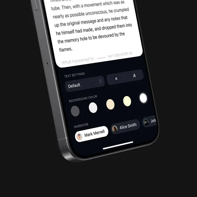
A dark-mode mobile reading interface shows text content with typography, background color, and narrator controls open at the bottom of the screen.
Summary
A dark-mode mobile reading interface shows text content with typography, background color, and narrator controls open at the bottom of the screen.
Visual description
The image shows a tilted smartphone mockup on a dark background with a white reading page covering the upper portion of the screen. A settings panel fills the lower area with text size controls, background color swatches, and narrator chips with avatars. The interface uses rounded cards, soft shadows, and muted labels on a near-black canvas.
Key takeaway
The strongest move is the layered reading experience: a large content card floating above a compact settings sheet. The second useful move is the restrained control row design, where a few tactile options communicate customization without visual clutter.
Reuse notes
Use this pattern for reader apps, audiobook apps, or accessibility settings where content and controls need to coexist. It works best when the screen should feel premium, calm, and easy to parse at a glance.