Preview image. Unlock full-res
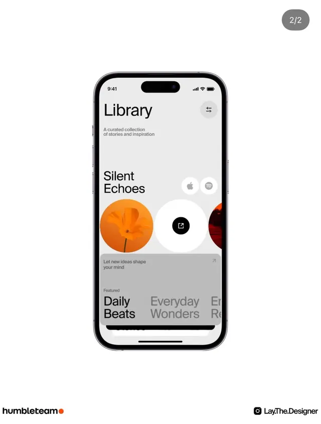
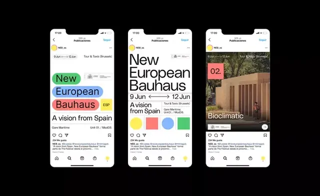
Three iPhone mockups in vertical layout displaying event/editorial content with hero typography, color accent labels, image galleries, and minimalist navigation.
Summary
Three iPhone screens showing a publications app with oversized event headlines, colorful category badges, typography-first layouts, and image galleries.
Visual description
Three vertical phone mockups displayed side by side showing the same app interface. The left screen features "New European Bauhaus" as a large, bold headline in sans-serif type with a subtitle "A vision from Spain" and event dates below; color badges mark content type. The center screen shows similar hierarchy with the same event title and additional metadata. The right screen displays "Bioclimatic" as the headline with a landscape photograph of an architectural space and a colored badge ("02"). Each screen has minimal chrome: a top status bar, header navigation labeled "Publications", and a bottom icon-based navigation bar. Background is white, type is black, and color accents (mint green, coral pink, golden yellow) serve as category markers.
Key takeaway
The scale and positioning of typography as the primary hero element on mobile; the restrained use of color badges as functional category signifiers that also break visual monotony; the consistent IA pattern (title, date, category, image) applied across screens to show template flexibility.
Reuse notes
Ideal template for event apps, editorial platforms, or cultural/tourism venues on mobile. The typographic focus and minimal navigation suit vertical scrolling and hero image presentation. Neutral palette allows color accents to drive categorization and visual interest. Works for gallery or collection listing screens.