Preview image. Unlock full-res
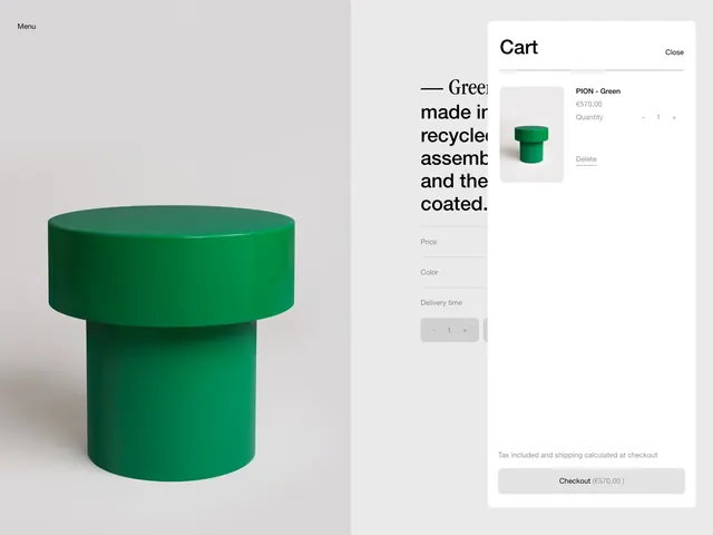
Split-screen e-commerce interface juxtaposing a minimalist product photograph with a clean, compact shopping cart panel.
Summary
Split-screen e-commerce layout pairing a product hero shot on the left with a compact shopping cart interface on the right, using deep green as a bold accent over neutral backgrounds.
Visual description
Left panel: centered minimalist photograph of a deep-green cylindrical household object on a light gray background. Right panel: white cart interface with a headline, product description excerpt, small thumbnail grid, pricing label, and primary action button. The interface uses generous white space, clean sans-serif type, and a tight, organized layout with muted gray dividers separating sections. The deep green object creates a strong color anchor that draws focus.
Key takeaway
The asymmetric split layout allowing a dominant image to share space with detailed product information without clutter. The restraint in accent color usage: the green appears only in the product itself and as a button fill, keeping the UI readability high. Compact form layout in narrow panels that still feels uncrammed.
Reuse notes
Effective for retail e-commerce sites selling physical goods where product photography is a strength. Works well paired with minimal typographies and cool-to-neutral palettes. The split layout is practical for desktop viewports but requires rethinking for mobile.