Preview image. Unlock full-res
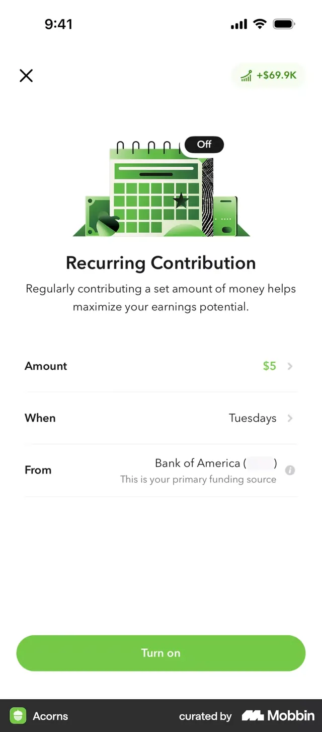
A fintech savings app screen (Acorns) presenting a recurring contribution setup form with illustrated calendar icon, green-and-white color scheme, and structured form fields.
Summary
A fintech savings form displaying recurring contribution setup with an illustrated calendar-grid icon, toggle control, and layered form fields (Amount, When, From) leading to a prominent green call-to-action.
Visual description
White background mobile screen. Top left shows an X (close button), top right displays "+$69.9K" with an upward trending chart icon in green, indicating account growth. Center features a large, flat illustrated calendar icon (light green grid with geometric shapes and a black star accent, no photorealism) that occupies substantial vertical space. Headline "Recurring Contribution" in heavy sans-serif. Descriptive text explains the feature benefit in smaller gray weight: "Regularly contributing a set amount of money helps maximize your earnings potential." A black toggle pill labeled "Off" sits above the illustration. Below the icon are three form field rows (Amount: "$5", When: "Tuesdays", From: "Bank of America (...)") each with a right-facing chevron indicating expandable selection. Primary call-to-action button "Turn on" in large green pill shape spans full width at bottom. App branding (Acorns logo and "curated by Mobbin" credit) appears at screen footer.
Key takeaway
An illustrated, symbolic icon (not a photo or realistic render) creates personality and approachability while staying within a fintech's trust envelope. The toggle placed above the form communicates this is an opt-in feature, lowering perceived friction. Green as the only accent color draws the eye predictably to growth metrics (+$69.9K) and the primary button. Form fields with chevrons indicate expandable options, reducing cognitive load on initial view.
Reuse notes
Effective for fintech savings, investment, or automation features. The illustrated icon approach works when the feature is conceptually simple (here: calendar/schedule); reserve it for features users will immediately understand. The toggle-then-form pattern is ideal for onboarding users into recurring/automatic features. Green accents work best when paired with gray and white; reserve bright greens for growth/positive metrics and primary CTAs. Scale down text sizing for smaller screens; the current large type reads best on iPhones 12+.