Preview image. Unlock full-res
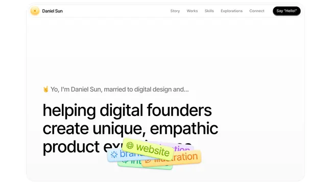
Playful portfolio hero introducing a designer with overlaid colorful pill-shaped tag labels woven directly into the bold headline text.
Summary
Playful portfolio hero introducing a designer with overlaid colorful pill-shaped tag labels woven directly into the bold headline text.
Visual description
White background with top navigation (logo, links, dark CTA button). A brief introductory line with a pointing emoji leads into a large, bold black sans-serif headline reading "helping digital founders create unique, empathic product exp" (cut off). Overlaid directly on the headline text are four soft-cornered pill-shaped labels in lime green, light blue, pastel yellow, and pink, each containing a single tag word like "website", "branding". The tags sit at varied y-positions and angles, creating organic visual rhythm while remaining clearly legible against the text.
Key takeaway
The idea of embedding small, colorful semantic labels directly into headline text rather than separating them, creating personality and interest without a sidebar. The soft pill shape and warm pastel colors stay approachable while standing out on black type. This technique works well for personal brands and creative portfolios where a label-heavy messaging strategy fits the tone.
Reuse notes
Natural fit for designer or creative agency portfolio landing pages. Works when you have 3-5 key skill tags to highlight in the intro. Keep the pills oversized enough to read at a glance but restrained enough not to overwhelm the main headline. Best on light backgrounds with bold dark text for contrast.