Preview image. Unlock full-res
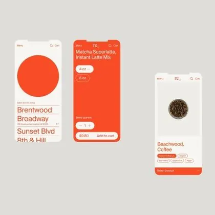
Mobile cards for coffee shops with large circular product images, location labels, and add-to-cart buttons in a warm, playful orange palette.
Summary
Mobile product cards for a coffee-shop ordering interface, each featuring a large circular photo of the drink or location, paired with location name, a rounded pill-shaped selector, and an add-to-cart button.
Visual description
Three mobile card layouts on a light gray background. Each card contains a bold orange rounded rectangle with a large white circular image (coffee drink or location marker) centered near the top. Below the circle sits a location name in rust-red sans-serif type (e.g., "Brentwood Broadway"), an orange pill-shaped dropdown (defaulting to "Milk"), and an orange rounded button labeled "Add to cart". The left card's circle shows a flat coffee illustration; the center card a stylized coffee cup; the right card an actual photo of coffee beans. The overall color scheme alternates between warm orange (#FF6B4A) and cream/off-white, with a secondary red-orange used for typography.
Key takeaway
The oversized circular imagery dominates each card and draws the eye; it is the primary interaction target. The pill-shaped dropdown feels lightweight and playful (no hard borders). The color weight is entirely on the card, while the background recedes, making each item a self-contained, tappable unit.
Reuse notes
Strong for food and beverage e-commerce, restaurant apps, or quick-order interfaces. The warm orange palette reads casual and approachable, not premium. Works best when the circular image is a strong product shot or illustration. The pill dropdown can feel cramped with long option labels; test with real content.