Preview image. Unlock full-res
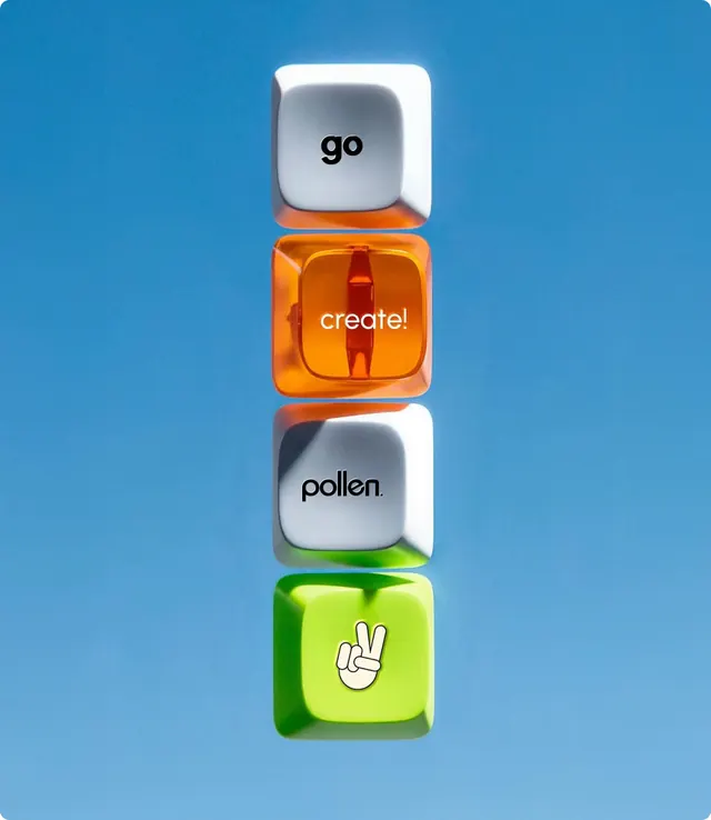
Four stacked app icon buttons (go, crochet, pollen, gesture) with alternating color labeling on sky-blue background.
Summary
Vertically stacked app icon buttons displaying go (gray), crochet (orange), pollen (gray), and gesture (lime) against a bright sky-blue background.
Visual description
Bright medium-blue background fills the frame. Four rounded-square app icons are centered and stacked vertically with even spacing: the first icon is light gray labeled "go", followed by a warm orange icon with a hand gesture labeled "crochet", then a light gray icon labeled "pollen", and finally a vibrant lime-green icon with a hand-peace gesture labeled "gesture". Each icon has a small label beneath in a clean sans-serif typeface. The color progression alternates between neutral and saturated, creating visual rhythm. Icons use minimal line-based imagery inside rounded-square containers.
Key takeaway
The alternating color cadence (gray, orange, gray, lime) across a neutral blue background makes the navigation pop without overwhelming. Vertically stacking app buttons creates a clean, mobile-native feel. The label positioning below each icon improves discoverability.
Reuse notes
Effective for mobile apps with multiple feature buttons, craft or creative tools, or gesture-driven interfaces. Works when features truly merit individual icon buttons rather than a menu. Best suited for apps targeting playful, younger audiences or creative professionals. The bright lime and orange may feel too energetic for professional or enterprise contexts.