Preview image. Unlock full-res
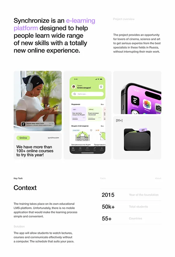
E-learning platform landing page showcasing the product across devices with large hero headline, platform context, and statistics in high-contrast, minimalist layout.
Summary
E-learning platform landing page showcasing the product across devices with large hero headline, platform context, and statistics in high-contrast, minimalist layout.
Visual description
Large black headline with accent color on key terms (purple "e-learning platform") anchors the top. Below, a project-overview description sits to the right in gray text. The center shows three device mockups: a mobile phone with bright lime green UI displaying course search and categories, a smartphone mockup showing a fitness or wellness app with pink-purple gradients, and a dark folder or file icon. Bottom section displays key metrics (2015 founding year, 50k+ students, 55+ countries) in large sans-serif type with light gray supporting text. Ample white space separates content blocks. A lime green "Online" badge links to the product URL. Throughout, high contrast between black text, white backgrounds, purple and lime accents creates visual hierarchy.
Key takeaway
Purple and green accent pair works as complementary contrast against neutral backgrounds without feeling chaotic. Device mockups grouped side-by-side with real product screenshots build credibility visually. Large numbers and minimal supporting text communicate scale and traction efficiently.
Reuse notes
Effective for SaaS or educational product landing pages where you need to show multi-platform presence and key metrics. The accent-color strategy scales to other brands. Works best with well-designed product screenshots to carry the visual weight in the mockup section.