Preview image. Unlock full-res
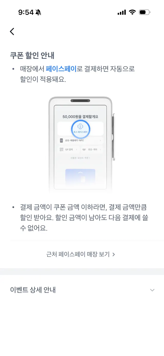
Mobile informational screen for fintech app, written in Korean, with instructional bullet points and a centered smartphone mockup showing payment processing details and quota information.
Summary
A mobile help or onboarding screen for a Korean fintech app, combining instructional text in bullet-point format with a centered smartphone mockup displaying payment quota and processing status visuals.
Visual description
White background with light gray text. Back arrow and status bar at top (9:54 AM, cellular/wifi/battery indicators). Title in bold sans-serif Korean ("쿠폰 활인 안내"). Two bullet points in smaller sans-serif, gray text, describing payment and quota terms. Centered below: grayscale smartphone mockup showing a blue circular progress indicator, Korean text, and quota value ("50,000원 건강검진료"). Light blue background inside mockup. Expandable/disclosure element ("이벤트 상세 안내") at bottom suggesting additional hidden content. Layout is vertically centered with generous margins. No color accent; pure monochromatic hierarchy through typography size and weight.
Key takeaway
The pattern of pairing instructional text with a device mockup showing the actual UI state being described. The bullet-point layout for complex terms is easy to scan. The light blue accent inside the mockup provides a subtle visual focus without distracting from the informational content. The expandable disclosure pattern for advanced details keeps the primary message uncluttered.
Reuse notes
Ideal for fintech apps needing to explain payment rules, promotional terms, or quota management to users. Works across cultural contexts when translated. The mockup approach is replicable for other app features. Consider this pattern for onboarding flows or help screens in mobile payment, wallet, or subscription contexts.