Preview image. Unlock full-res
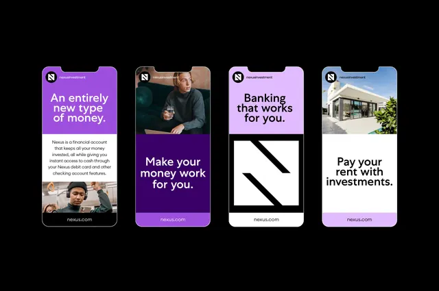
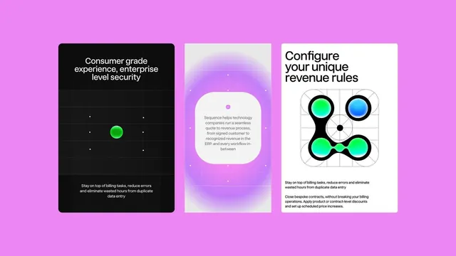
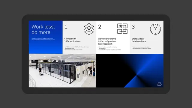
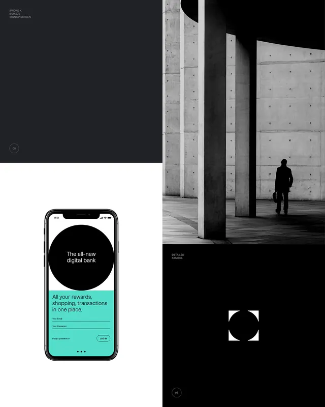
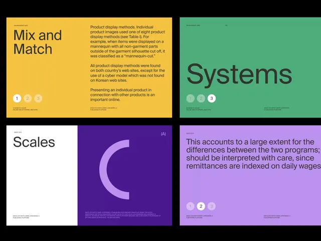
Four-panel dark UI system featuring high-contrast sans-serif text against black, teal, and purple backgrounds, with small instructional diagrams and bright accent colors.
Summary
Four-panel dark documentation interface using teal, yellow, and purple accent colors with white labels and instructional diagrams on pure-black backgrounds.
Visual description
Four distinct panels arranged in a 2x2 grid on black backgrounds. Top-left panel has bright yellow background (#F4C241) with bold sans-serif "Mix and Match" heading in dark text, followed by smaller body text and three icon placeholders. Top-right panel uses teal (#4EAD7C) background with large bold "Systems" heading and three icon dots. Bottom-left is mostly black with "Scales" label and a large abstract "C" curve shape in bright magenta/purple (#BB91EF). Bottom-right combines black background with light purple (#BB91EF) content area featuring body text and instructional icon placeholders. All text is bold, clean sans-serif with white or dark text for maximum contrast. Minimal imagery, icons used as functional placeholders rather than decoration.
Key takeaway
The triadic color system (teal, yellow, purple) creates clear visual separation between distinct UI sections while maintaining a cohesive dark aesthetic. The combination of black backgrounds with one bright accent per panel allows information categories to be distinguished instantly. High contrast and bold typography make dense technical documentation readable and scannable.
Reuse notes
Ideal for SaaS documentation, fintech dashboards, or data-heavy applications where clarity and hierarchy trump decoration. The color blocking per panel works well for instructional UI showing different system features or documentation sections. Test contrast ratios on actual content before shipping; works best when each panel contains roughly equal visual weight.