Preview image. Unlock full-res
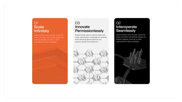
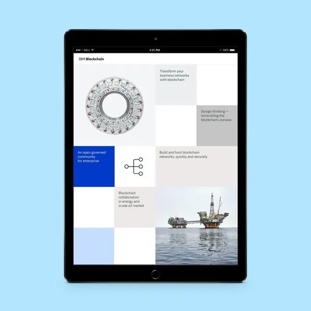
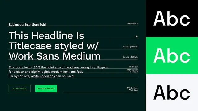
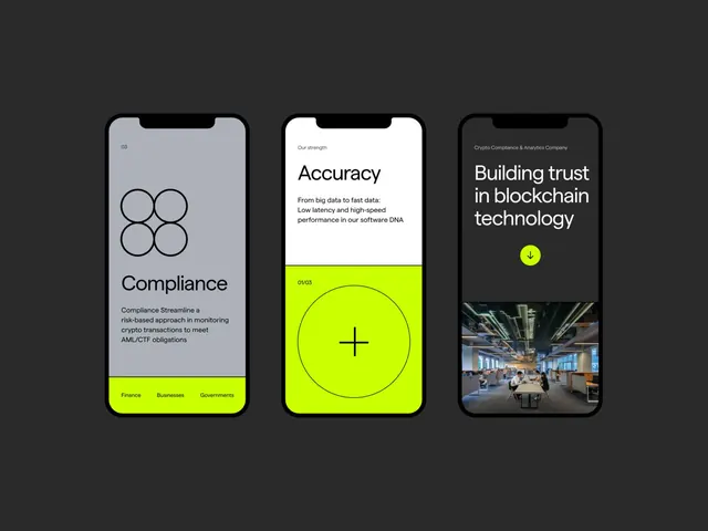
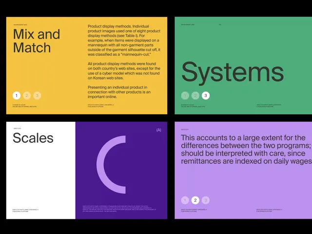
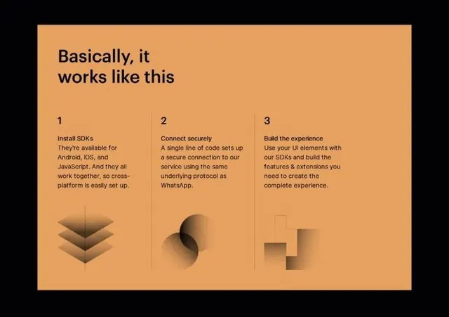
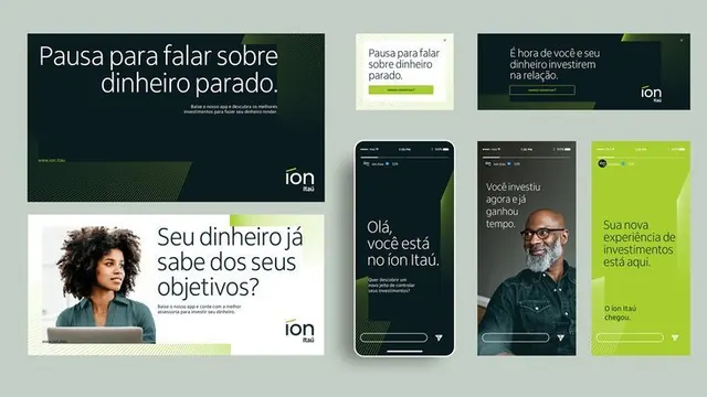
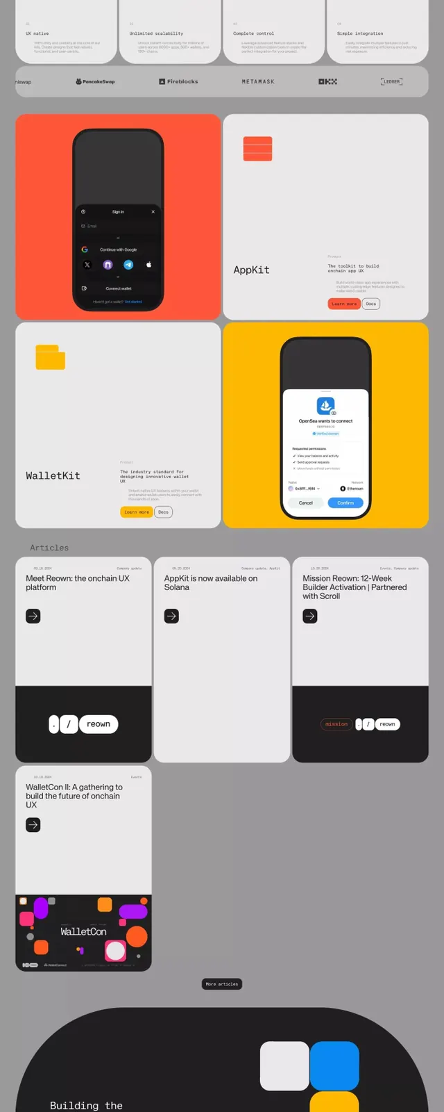
A long-form product showcase scrolling vertically through developer kits and UI modules, using a consistent card grid layout with bright orange and yellow accent actions on grayscale and dark backgrounds.
Summary
A vertical product showcase of fintech and blockchain development tools arranged in a modular card system with consistent spacing, using bold orange and yellow CTAs against dark and light panels.
Visual description
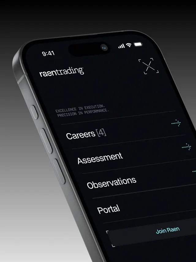
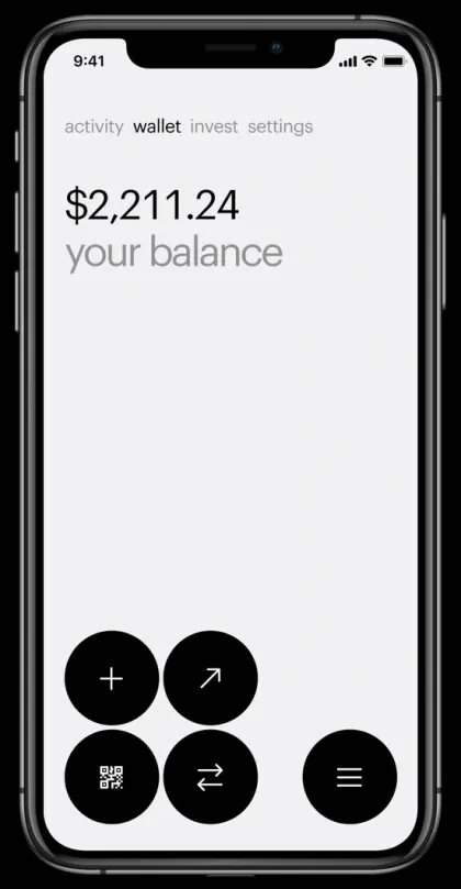
A long-form layout scrolling vertically through multiple product cards. The top section shows a hand holding a smartphone mockup with interface UI against a gray background, with a bright-blue CTA button. Below are rows of product cards in white, orange, and yellow backgrounds: AppKit, WalletKit, and other developer modules each with icon, title, and CTA button. A section for partner logos and articles follows, with cards featuring dark backgrounds and branded accents. The lowest sections display gradient backgrounds (dark-to-orange, dark-to-yellow) showcasing interface examples and a final branding section with colorful shapes and the "reOwn" wordmark. Sans-serif type remains consistent throughout, with monochromatic and orange/yellow color blocking creating clear hierarchy.
Key takeaway
The consistent card-grid system used to showcase modular products and features. The use of warm accent colors (orange, yellow) on neutral (white, gray) and dark backgrounds to drive attention to CTA buttons. The vertical story-flow that progresses from product hero, to features, to partner validation, to final closing visual.
Reuse notes
Strong pattern for fintech, crypto, or developer-platform landing pages. The card-modular approach scales well for many products or features. The accent-color strategy works best when the neutral backgrounds are truly muted (gray/dark); it can feel chaotic on bright white if overdone.