Preview image. Unlock full-res
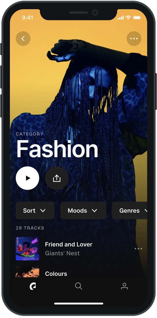
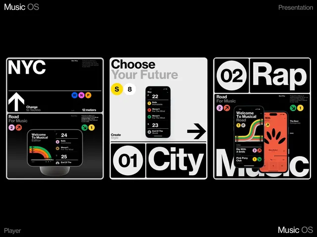
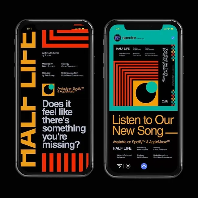
A mobile app interface mockup for a music application showing two iPhone screens with bold geometric UI design, vibrant color blocks, and song information for Half Life.
Summary
A two-screen mobile app mockup for a music application featuring bold geometric shapes, contrasting color blocks in orange and cyan on black backgrounds, and typography for a song called Half Life.
Visual description
Two iPhone screens are displayed side by side against a black background. Left screen: A dark interface with large yellow and orange geometric shapes forming HALF LIFE text, accompanied by red horizontal bars and small white copy about the track details. Right screen: A cyan-green background containing the word spector in small type, with a feature section for Half Life song, geometric red striped shapes, a yellow and cyan circular badge, and navigation controls at the bottom. Both screens use sans-serif typography in bold weights, with clean spacing and high contrast. The design system shows consistent branding across both screens with vibrant color accents against dark backgrounds.
Key takeaway
Bold geometric elements and high-contrast color can create memorable, distinctive music app interfaces. Consistent visual systems across screens maintain branding while geometric shapes add sophistication and energy.
Reuse notes
Perfect template for music streaming apps, podcast platforms, or audio entertainment applications. The bold aesthetic appeals to younger, design-forward users. The geometric approach is distinctive enough to stand out in app stores while remaining functionally clear. Works for iOS and Android mobile interfaces.