Preview image. Unlock full-res
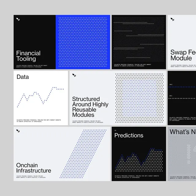
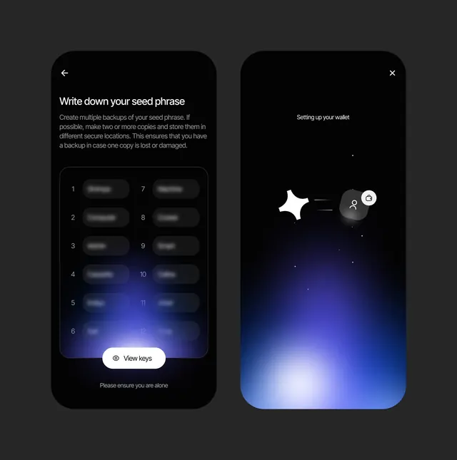
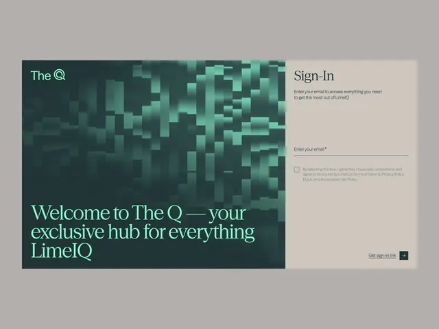
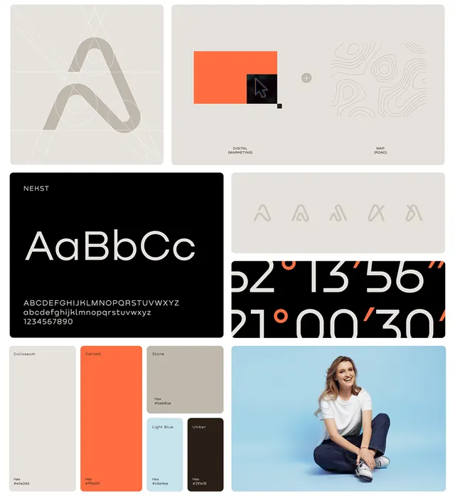
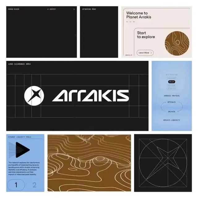
Multi-screen brand system for a blockchain/DeFi protocol (Arrakis) featuring dark UI, geometric logo systems, organic wavy patterns, and minimalist data visualization.
Summary
Multi-screen brand system for Arrakis, a blockchain/DeFi protocol, combining a stark dark UI palette with warm bronze accents and organic wavy pattern language.
Visual description
The composition shows six distinct screens arranged in a grid, each demonstrating different elements of the Arrakis brand system. Top left: a black field with the "HAND BLACK" label and numbered reference. Top center: a tall black rectangle labeled "JETERAINS TORO." Top right: a light beige/cream onboarding card reading "Welcome to Planet Arrakis" with a circular organic wood-grain illustration and a "Start to explore" button. Middle row: the brand's primary logo (a geometric X-shaped mark) with "ARRAKIS" wordmark displayed across a dark background with a grid overlay showing clearance area rules. Right side middle: a light blue information card with "ARRAKIS PROTOCOL," "OPENMAIN," and "ARRAKIS LIQUIDITY" text labels stacked vertically. Bottom left: a blue background with a large black play-button icon and text describing dynamic liquidity pools. Bottom center: a large organic, wavy pattern in brown and gold tones resembling topographic or liquid flows. Bottom right: a dark geometric diagram with white lines forming angular, intersecting patterns and circular geometry reference points.
Key takeaway
The integration of warm, organic wavy patterns as a secondary brand language within a strict geometric dark UI; the grid-based logo clearance specification as a visual reference; the use of muted color blocking (blue, brown, cream, dark) to distinguish different functional screens while maintaining visual cohesion; the scale shift from minimal geometric UI to detailed wavy-pattern illustrations for visual interest.
Reuse notes
Ideal for DeFi, fintech, or blockchain product design where technical credibility must pair with approachable onboarding. The organic wavy pattern works as a brand accent to soften pure geometric layouts. The light background cards provide breathing room in an otherwise dark interface. Best suited for complex protocol or trading platforms targeting a tech-savvy audience.