Preview image. Unlock full-res
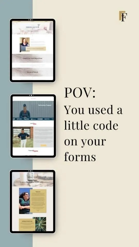
A vertical social-media promotional graphic stacking three iPad device mockups showing proposal and client-onboarding form pages, with a bold serif POV caption promoting no-code form customization.
Summary
A vertical social-media graphic using three stacked iPad mockups to showcase proposal and onboarding form screens, with a large serif "POV: You used a little code on your forms" headline as the hero copy.
Visual description
The image is a portrait-format graphic split vertically: the left half uses a two-tone wash -- dusty teal at top and cream/sand below -- as the backdrop for three iPad device frames stacked diagonally top-to-bottom. Each iPad shows a different form or proposal page: the topmost shows a profile and objectives layout with photography; the middle shows a partnership proposal with a header image and branded section; the bottom shows a client service contract with a warm editorial photo and a key-value layout. The right half of the image is a cream/warm white panel holding large, centered display type -- "POV:" in bold all-caps sans-serif, followed by "You used a little code on your forms" in a large, loose serif with natural word-wrap. A small gold serif monogram logo sits in the top-right corner. The overall palette is warm neutrals (cream, sand, teal) with near-black text.
Key takeaway
The diagonal stacking of device frames on a split-tone background creates a sense of depth and motion without animation. Using the "POV:" social-media format as a headline pattern makes the product benefit immediately legible on a feed scroll. Mixing a bold sans-serif label with a relaxed serif sentence for the caption adds personality without sacrificing readability.
Reuse notes
Effective as a social-media or Stories asset for promoting a web tool or service -- particularly form builders, proposal software, or client-portal tools. The vertical format is optimized for Instagram or TikTok. The POV headline format works best when the benefit can be stated in one natural sentence. The warm, editorial palette positions the product as approachable rather than enterprise.