Preview image. Unlock full-res
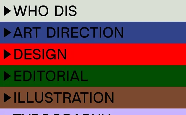
Web navigation interface featuring horizontal color-coded bands with all-caps labels and play-symbol indicators.
Summary
A horizontal navigation menu interface with color-coded band sections, each labeled in all-caps sans-serif with a small play triangle icon.
Visual description
Five horizontal bands in contrasting colors (cream, navy, red, dark green, brown, and partially visible lavender) spanning the full width. Each band contains left-aligned all-caps text labels (WHO DIS, ART DIRECTION, DESIGN, EDITORIAL, ILLUSTRATION) preceded by a small black triangle pointing right. The typography is bold and condensed, creating strong visual separation between categories. The color blocking creates a playful yet systematic approach to information organization.
Key takeaway
Color-coding as organizational principle combined with directional typography (the play symbol) creates intuitive hierarchy. Each color zone is distinct enough to function as independent landing areas while maintaining visual cohesion.
Reuse notes
Effective for portfolio sites, agency homepages, or service menu structures. The color approach works well for categorizing content or navigation paths. Works equally well for horizontal or vertical implementations. Requires careful color selection to maintain sufficient contrast between adjacent bands.