Preview image. Unlock full-res
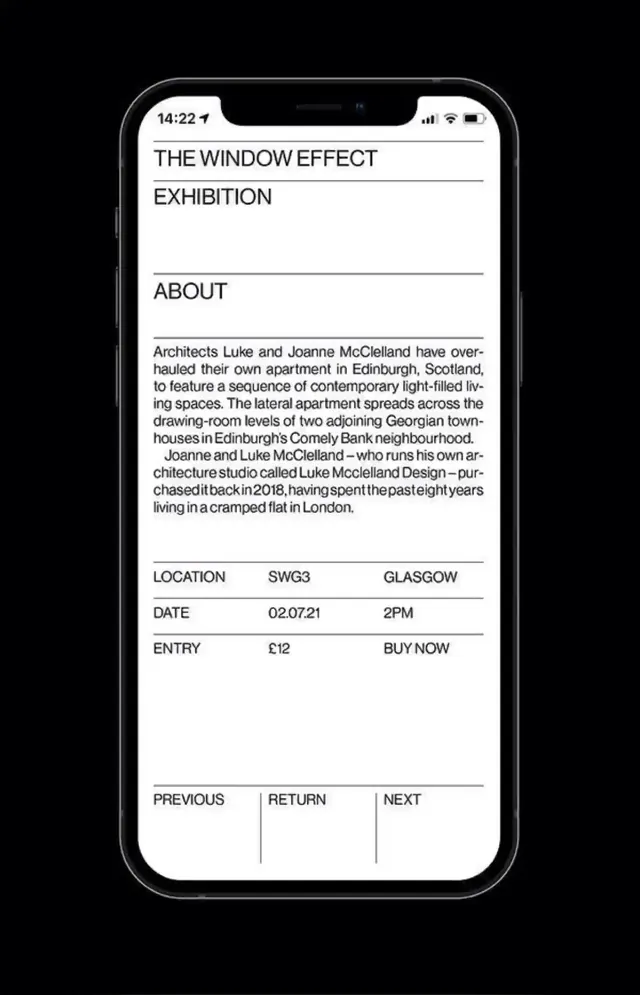
A mobile exhibition information page displaying event title, description, location, date, entry price, and navigation controls in high-contrast typography.
Summary
A mobile exhibition page for "The Window Effect" showing about text, location, date, price, and navigation buttons; all-caps section labels separate left-aligned content with subtle horizontal rules.
Visual description
Framed in an iPhone mockup with notch and home indicator, the screen is pure white with black text. The headline "THE WINDOW EFFECT EXHIBITION" uses bold, large sans-serif caps with a thin horizontal line below. An "ABOUT" section label (all-caps, gray) precedes body text about architects Luke and Joanne McClelland redesigning an Edinburgh apartment. Below is another horizontal rule, then a three-column data block: LOCATION shows "SWG3 GLASGOW" on left, DATE shows "02.07.21 2PM" centered, ENTRY shows "£12 BUY NOW" right-aligned. All fields use a monospace or fixed-width appearance. Navigation buttons span the bottom: dark-text caps reading "PREVIOUS | RETURN | NEXT" separated by vertical lines. Overall rhythm is spare and architectonic, with rhythm created by repeated label-data pairs and horizontal divisions.
Key takeaway
All-caps labels create visual separators without relying on heavy rules or dividers. Left-align content with right-align data (price, time) for natural scanability. The monospace-like treatment of structured data (dates, costs) signals "informational" versus body prose. Horizontal rules are thin and subtle, never heavy, keeping the hierarchy lean. No decorative color, shadows, or icons; text alone carries the design.
Reuse notes
Perfect for cultural events, ticketed exhibitions, and event-listing apps targeting a design-forward audience. The high-contrast monochrome approach works equally well in print and digital. Scales to mobile and small screens without adaptation; avoid adding colors, icons, or CTAs outside the layout system or it breaks the minimalist spell. The PREVIOUS/RETURN/NEXT structure implies carousel pagination, ideal for browsing multiple events.