Preview image. Unlock full-res
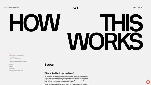
Minimalist web design for A24 film distribution Screening Room FAQ page with large bold headline, clean navigation, and documentation-style layout.
Summary
Clean, minimal web interface for A24 film company's Screening Room help documentation. Large sans-serif headline, left-aligned navigation menu, and generous white space create accessible, content-focused design.
Visual description
The page displays the A24 logo (sans-serif wordmark) in the header with "LOG IN / SIGN UP" right-aligned. A large black sans-serif headline reads "HOW THIS WORKS" spanning most of the viewport width. Below is a left sidebar navigation menu with categories including "Basics," "Account," "Ticketing," "Screenings," "Casting & Streaming Devices," and "Technical." The main content area begins with a "Basics" section heading followed by FAQ question "What is the A24 Screening Room?" and explanatory paragraph text in a readable serif or mixed typeface. The design uses a pure white background, black text, and red accent line next to the "Basics" label. Layout is clear, spacious, and content-first with minimal visual decoration.
Key takeaway
Effective documentation design: the large headline immediately communicates purpose, left-aligned navigation provides clear wayfinding, and ample white space maintains readability. The design prioritizes content over aesthetic flourishes. The subtle red accent adds visual interest without disrupting focus. This Swiss-style approach ensures accessibility and clarity for technical documentation.
Reuse notes
Strong reference for SaaS help centers, API documentation, FAQ pages, or any content-heavy interface. The navigation pattern is reusable for knowledge base structures. Works well for brands needing accessible, professional interfaces. The monochromatic palette ensures fast load times and print-friendly presentation. Similar approach suits accessibility-focused design contexts.