Preview image. Unlock full-res
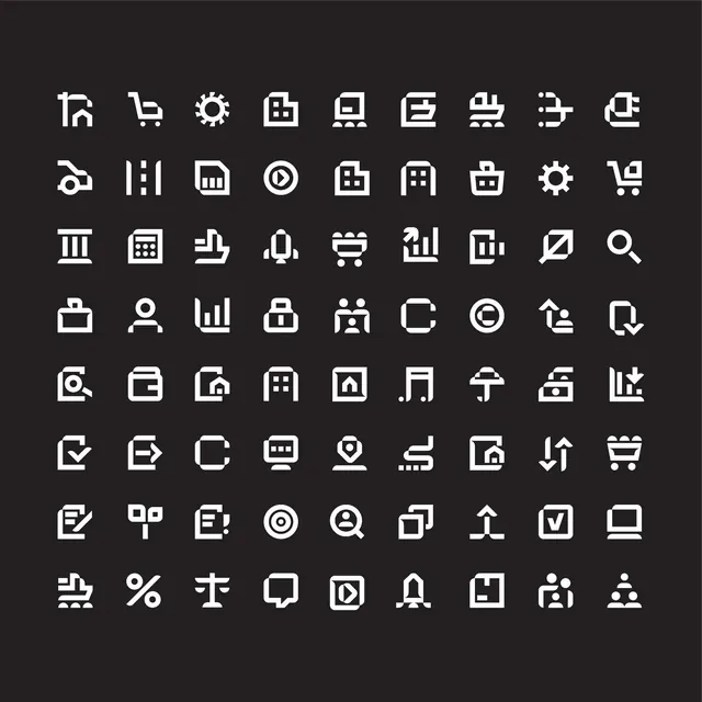
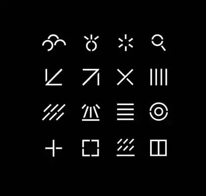
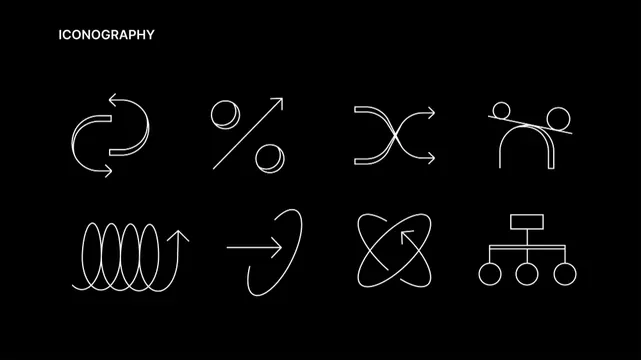
A 12-icon grid of thin outline glyphs representing abstract concepts and interactions: refresh, compare, connections, teamwork, wave, growth, orbit, and hierarchy.
Summary
Twelve monoline icons arranged in a 4x3 grid on a pure black background, each rendered in single-weight white strokes representing common interface and conceptual metaphors.
Visual description
Eight distinct icons displayed twice across four rows: a curved-loop refresh symbol; a sphere and diagonal line suggesting compare or growth; a horizontal hourglass-like flip gesture; two people silhouettes leaning toward each other for collaboration; a tight coil representing waves or cycles; a curved arrow suggesting forward motion or flow; overlapping circles in a triad implying network or three-way connection; and a hierarchical tree structure with a rectangular root and three circular nodes below. All glyphs use the same thin, continuous stroke weight with rounded ends and minimal serif, set against pure black for maximum contrast.
Key takeaway
The consistent stroke weight across all marks creates a unified system feel even with diverse concepts. The simplicity of each icon makes them readable at small sizes on dark backgrounds. The balanced use of curves and geometric shapes keeps the set feel contemporary without trendy detail work.
Reuse notes
Strong foundation for a design system, SaaS app, or developer tool needing professional, system-level icons. Works at any scale because the line-weight doesn't break down. Excellent for dark-mode UIs or high-contrast accessible design. Less suitable for playful or consumer-facing contexts; the monochrome and geometric approach read corporate and technical.