Preview image. Unlock full-res
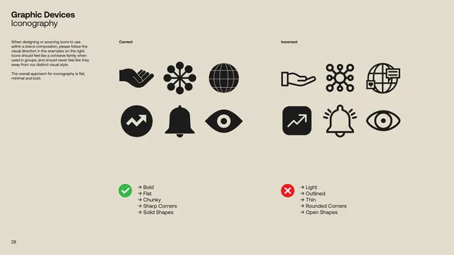
Teaching grid comparing correct and incorrect icon construction techniques across twelve solid-vs-outlined symbol pairs with do/dont checkmarks.
Summary
Instructional icon reference comparing two construction approaches (solid fill vs. outlined strokes) across twelve symbols, each marked as correct or incorrect using green-checkmark and red-X indicators.
Visual description
Beige background with a titled section labeled "Graphic Devices" and "Iconography." Two rows of six icon pairs arranged in a structured grid. Left column shows six solid-filled black symbols (mountain, flower, globe, handshake, cluster, globe-grid, waveform, bell, eye) each marked "Correct" with a green circle containing a white checkmark. Right column shows the same symbols in outlined/stroked style, each marked "Incorrect" with a red circle containing a white X. Below the grid, a legend lists construction rules: left side (Correct) emphasizes solid fills, precise angles, and closed corners; right side (Incorrect) flags open strokes, outlined silhouettes, and open corners. Small page number visible bottom left.
Key takeaway
The side-by-side do/dont grid format makes design rules immediately obvious; consistent iconography across both versions clarifies only the execution method differs; color-coded circular badges (green/red) provide instant visual judgment without reading text.
Reuse notes
Ideal for design-system documentation, icon-library guidelines, and design-critique teaching materials. The approach scales to any icon set. Works particularly well in print or PDF handbooks where the structured comparison aids retention.