Preview image. Unlock full-res
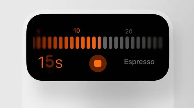
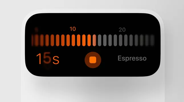
A minimalist interface design for a coffee timer showing progress bars and timing information with orange accent color on a dark display.
Summary
A coffee brewer timer interface mockup featuring a progress bar and elapsed time display in a minimal dark UI with warm orange accents.
Visual description
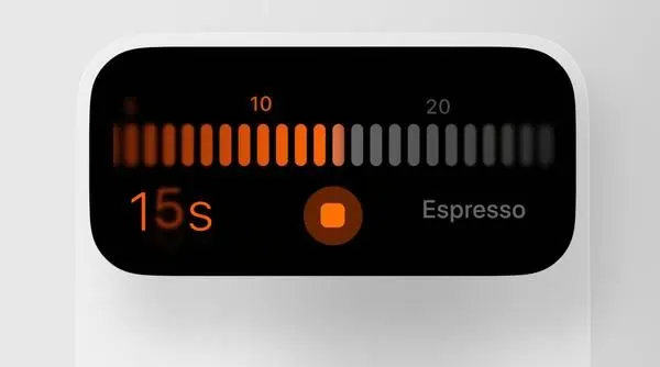
A rounded rectangular display with a black background shows an espresso timer. At the top, two numeric scales from 10 to 20 are represented by vertical bars fading from orange on the left to gray on the right. Below, in large orange monospace numbers, "15s" indicates elapsed time. To the right is a filled circular button in warm orange-brown. Below that is the label "Espresso" in gray sans-serif. The interface is shown mounted on a light gray surface. The design emphasizes clarity and minimal visual hierarchy.
Key takeaway
The color pairing of orange on black creates a high-contrast, readable display suited to hardware contexts. The progress-bar visualization is intuitive and reduces the need for additional text. The rounded container suggests a premium appliance interface.
Reuse notes
Excellent for IoT, kitchen appliance, and smart home interfaces. The minimal dark mode is suitable for technical products and applies well to timers, brewing systems, or any sequential process. The warm accent color is practical for high visibility while maintaining sophistication. Works for both app and hardware UI contexts.