Preview image. Unlock full-res
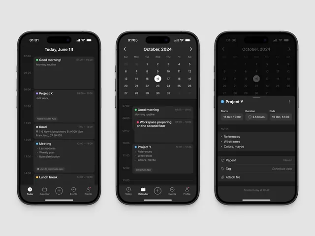
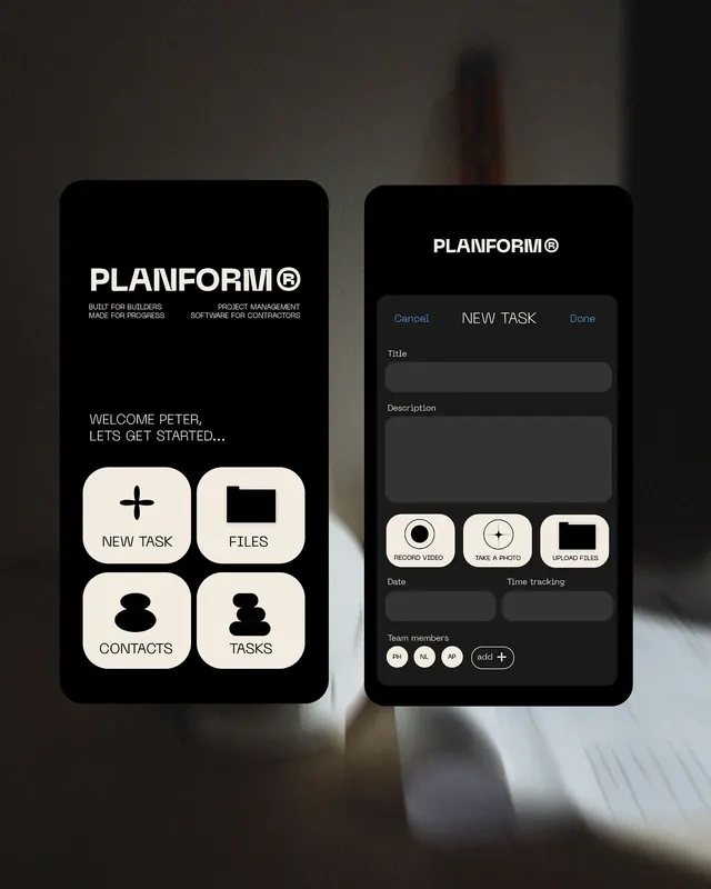
Two-screen mobile UI for Planform, a dark-mode project management app pairing a grid-based task menu with a detailed task-creation form.
Summary
A dark-mode pair of mobile screens for Planform, a project management tool. The left screen presents four primary tasks as large rounded-square icon buttons in a 2x2 grid (New Task, Files, Contacts, Tasks) with a welcome message below; the right screen is a detail form for creating a new task, with fields for title, description, date, time tracking, and team member selection.
Visual description
Left screen: black background with the Planform logo and tagline at top, followed by "WELCOME PETER, LET'S GET STARTED..." in off-white sans-serif. Four ivory rounded-square buttons occupy the lower half in a 2x2 grid, each with a black icon and label (plus sign, folder, people, checkmark), clearly delineated with generous spacing. Right screen: same black background with Planform header and action buttons (Cancel, New Task, Done) in blue and white. Below is a vertical form with text inputs for Title (dark field, minimal styling) and Description (larger text area), followed by smaller sections for Date, Time tracking toggle, and Team members (avatars plus an add button). All typography is sans-serif; the overall hierarchy is crisp and scannable.
Key takeaway
The stark dark-background contrast with cream/off-white typography making text pop without color distraction. The 2x2 grid of icon buttons as a launchpad pattern is instantly recognizable. The form screen demonstrates restrained field styling and tight vertical spacing, relying on field labels and whitespace rather than borders for clarity.
Reuse notes
Ideal reference for mobile-first SaaS apps requiring task or project management flows. The dark mode works for technical audiences (dev tools, construction software, enterprise). The grid-based task picker is reusable in onboarding or dashboard contexts. Caveat: the warm (off-white, subtle beige) tones work here but shift away from pure monochrome; pair with a cool accent color if adding interactivity.