Preview image. Unlock full-res
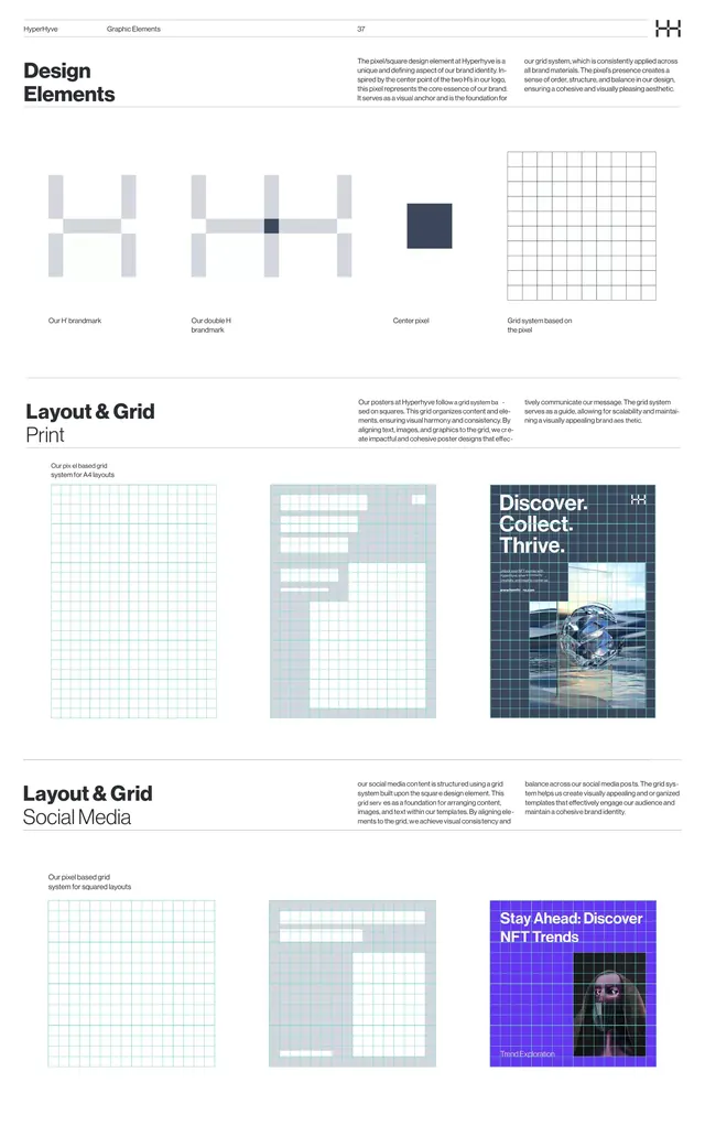
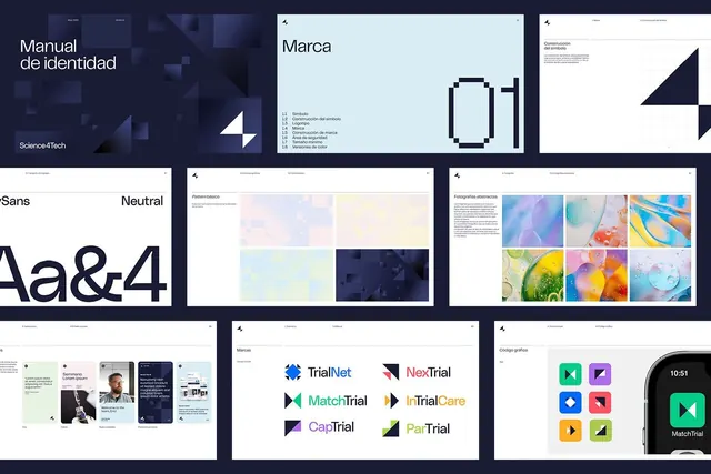
Nine-page brand guideline spread showcasing modular symbol system, color palettes, typography rules, and brand sub-product logos for a tech company.
Summary
Nine-page brand guideline spread for Science4Tech, a tech firm, showing symbol construction, color system (pastel and dark palettes), sans-serif type, and a family of geometric product logos (TrialNet, NexTrial, MatchTrial, InTrialCare, CapTrial, ParTrial).
Visual description
Dark navy hero page with white "Manual de identidad" headline and Science4Tech wordmark; second page explains symbol construction with technical line drawings. Center spread shows symbol usage rules on light cyan background with annotated mark anatomy. Color palette page presents two systems: pastel blocks (peach, yellow, lavender, light blue) and dark navy tones. Typography page shows sans-serif specimen with "Aa&4" highlighting. Photography page displays six abstract gradient studies (purple-to-blue, yellow-to-pink, rainbow swirls, soap bubbles). Logos page arranges six geometric-marked product sub-brands in a 2x3 grid, each with distinct accent color (teal, red, green, purple, yellow). Bottom row shows carousel mockups and app icon grids. All pages share consistent header logo, grid spacing, and minimalist color hierarchy.
Key takeaway
The symbol-construction sheet with orthographic rules for mark scaling and safe space; the dual-palette approach (saturated pastels + neutral darks) supporting both playful and serious contexts; the product logo family where each mark inherits one accent color while keeping the symbol geometry consistent.
Reuse notes
Essential reference for building a modular brand mark system and multi-product identity architecture. The color-palette layout works especially well for tech/SaaS where you need both approachable and professional tonalities. Photography guidelines using abstract gradients avoid literal imagery while staying visually distinct.