Preview image. Unlock full-res
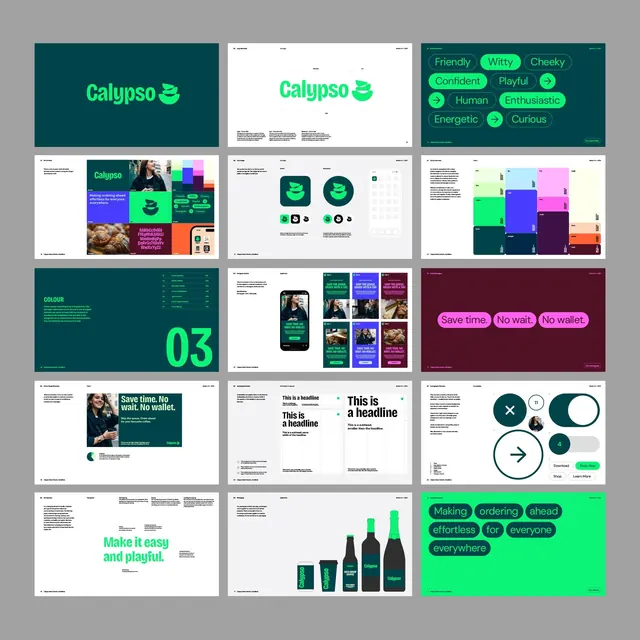
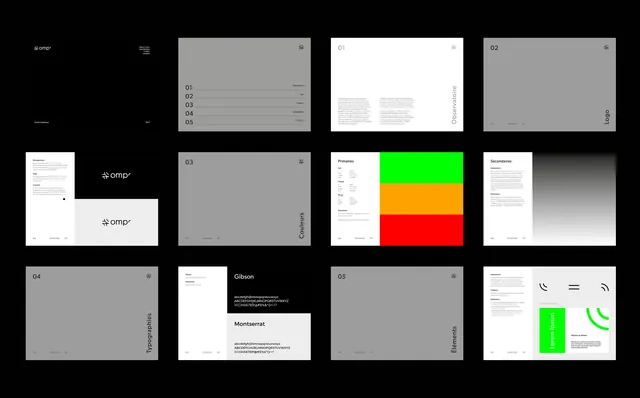
Brand identity system documentation with numbered component pages, color swatches, typography specimens (Gibson, Montserrat), and guidelines for logo, colors, typography, and UI elements.
Summary
Brand identity system documentation with numbered component pages, color swatches, typography specimens (Gibson, Montserrat), and guidelines for logo, colors, typography, and UI elements.
Visual description
A 3x4 grid showing 12 pages of a design system. The Ompr logo and wordmark appear top-left (in monochrome and with a geometric mark). Pages 01-05 are numbered sequentially, featuring muted gray placeholders with section headings (Overview, Logo, Colors, Typography, Elements). The central spread displays the primary color palette: three bright blocks (neon green, orange, red) with labels for Primaries. Typography pages show typeface specimens (Gibson serif and Montserrat sans-serif) with full character sets and metrics. Secondary pages on the right show gray backgrounds with "Logo", "Typography", and "Elements" headings in black sans-serif. The overall layout is a strict grid with ample white space, minimal ornamentation, and a professional, documentation-focused aesthetic.
Key takeaway
The numbered, modular page system for communicating design guidelines in a logical, memorable sequence; the restrained use of three accent colors against neutral backgrounds to maximize contrast and hierarchy; the combination of gray placeholder space (for copy) and specific component showcases (swatch, type, mark) on a single spread.
Reuse notes
Excellent reference for brand guidelines documentation, design-system presentations, or client proposals. The numbered-section approach is highly scalable (10 pages, 20 pages, 50 pages). Works well for agencies needing to deliver consistent visual standards. Avoid using neon accent colors on small UI elements unless they must demand absolute attention.