Preview image. Unlock full-res
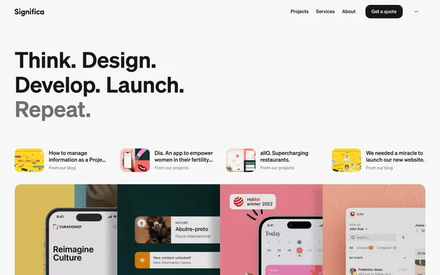
A clean, minimal design-agency website with stacked sans-serif hero text, horizontal scrolling project-card gallery, and a colorful case-study mockup grid below.
Summary
A clean, minimal design-agency website with stacked sans-serif hero text, horizontal scrolling project-card gallery, and a colorful case-study mockup grid below.
Visual description
The header spans full width with "Significa" wordmark (left) and a minimal navigation menu (Projects, Services, About) plus a dark rounded CTA button ("Get a quote") on the right. The hero section features four lines of oversized, bold black sans-serif stacked left-aligned: "Think. Design. Develop. Launch. Repeat." (the final "Repeat." is gray, creating emphasis through color contrast). Below the hero, five small horizontal cards display project highlights with flat illustrations (yellow, pink, dark green, coral accents) and short captions like "How to manage information as a Project..." and "Dia. An app to empower women." The bottom half shows a full-width gallery of four large device/interface mockups in a loose grid: a phone mockup on yellow, a social app on dark green, a calendar interface on pink, and a chat app on coral. Each mockup is surrounded by solid-color backgrounds that extend the brand's warm palette.
Key takeaway
The stacked, incomplete-sentence hero ("Think. Design. Develop...") is a memorable way to state a value proposition without sounding boilerplate. The color-callout final word creates hierarchy. The two-tier gallery pattern (small cards + large mockups) gives portfolio depth without overwhelming. The flat illustrative accents (not photographic) feel approachable and craft-led.
Reuse notes
Excellent template for any creative agency, design studio, or services firm. The bold sans-serif and color-blocked backgrounds read as confident and creative; works especially well for design/branding/web agencies. The two-level case-study display lets you tell both summary and detail stories. Light background and dark typography are legible and timeless. Mockup styling (device frames + colored backgrounds) is a standard pattern; adapt the colors to match your brand palette.