Preview image. Unlock full-res
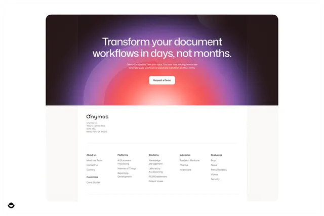
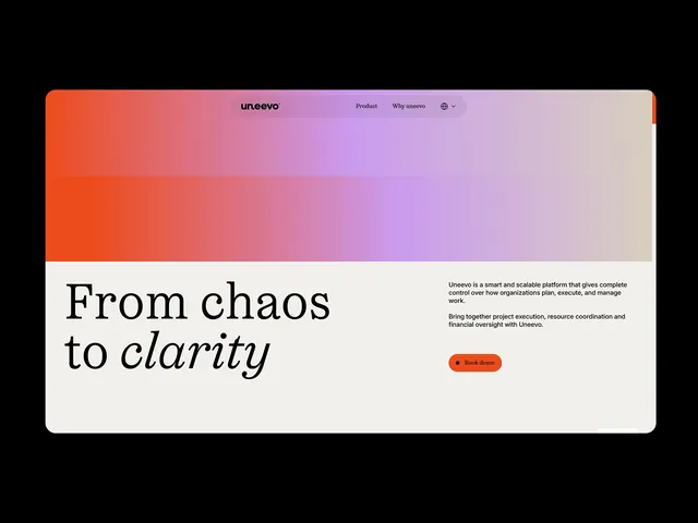
A SaaS landing page hero split between a large red-to-lavender gradient header block and a cream-white body panel carrying an oversized mixed-weight headline and a book-demo CTA.
Summary
A project-management SaaS hero that uses a vivid red-to-lavender gradient as the full-width header image, then drops into a cream panel where a large mixed-serif-sans headline ("From chaos to clarity") and a coral book-demo pill button anchor the value proposition.
Visual description
The viewport shows a centered navbar (logo "un.eevo" centered, two nav links, a globe/language toggle at right) floating over a large rectangular gradient block that fills the top two-thirds of the frame. The gradient transitions from a saturated tomato-red at the left edge through coral pink to a soft lavender at the right edge, with no imagery or type inside it -- the color alone carries the visual weight. Below the gradient block, the layout switches to a warm off-white cream panel. On the left of this panel sits the headline: "From chaos to" in a large regular-weight sans-serif, with "clarity" on the second line rendered in an italic serif face -- the contrast between the two styles is the design's central typographic move. To the right, two short body-copy paragraphs describe the product in gray, followed by a small coral-filled pill button labeled "Book demo" with a bullet indicator. The overall composition is relaxed and asymmetric in the lower half, with plenty of negative space.
Key takeaway
The gradient-as-image technique -- using pure color field instead of a hero photo or illustration -- reduces visual clutter while still creating an immediate first impression. The mixed-serif-sans headline (sans for the setup phrase, italic serif for the payoff word) is a well-executed contrast move that can be adapted to any two-word value statement. Keeping the CTA pill small and low-contrast (coral, not neon) signals confidence rather than urgency.
Reuse notes
Best suited for SaaS, B2B productivity, or project-management products where "clarity" or "control" is a core value. The gradient field works only if the transition is smooth and the colors are intentional -- poor execution reads as unfinished. The mixed-serif CTA headline pattern requires a headline that genuinely has a one-word emotional payoff. Pair this hero with a dense features grid below to offset the sparse upper section.