Preview image. Unlock full-res
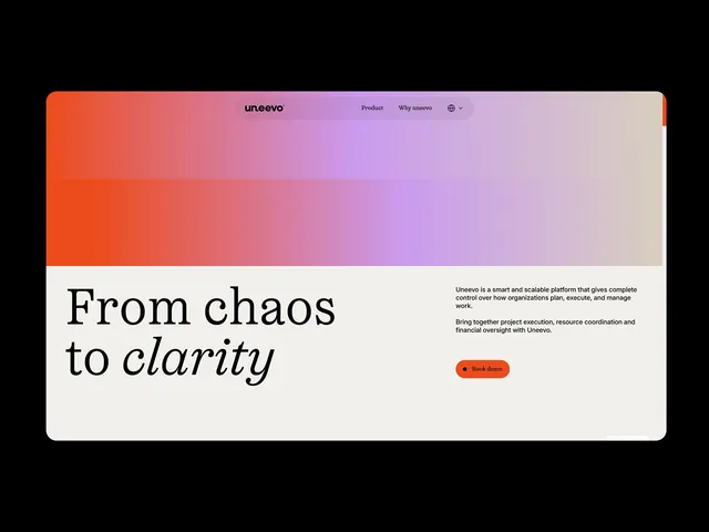
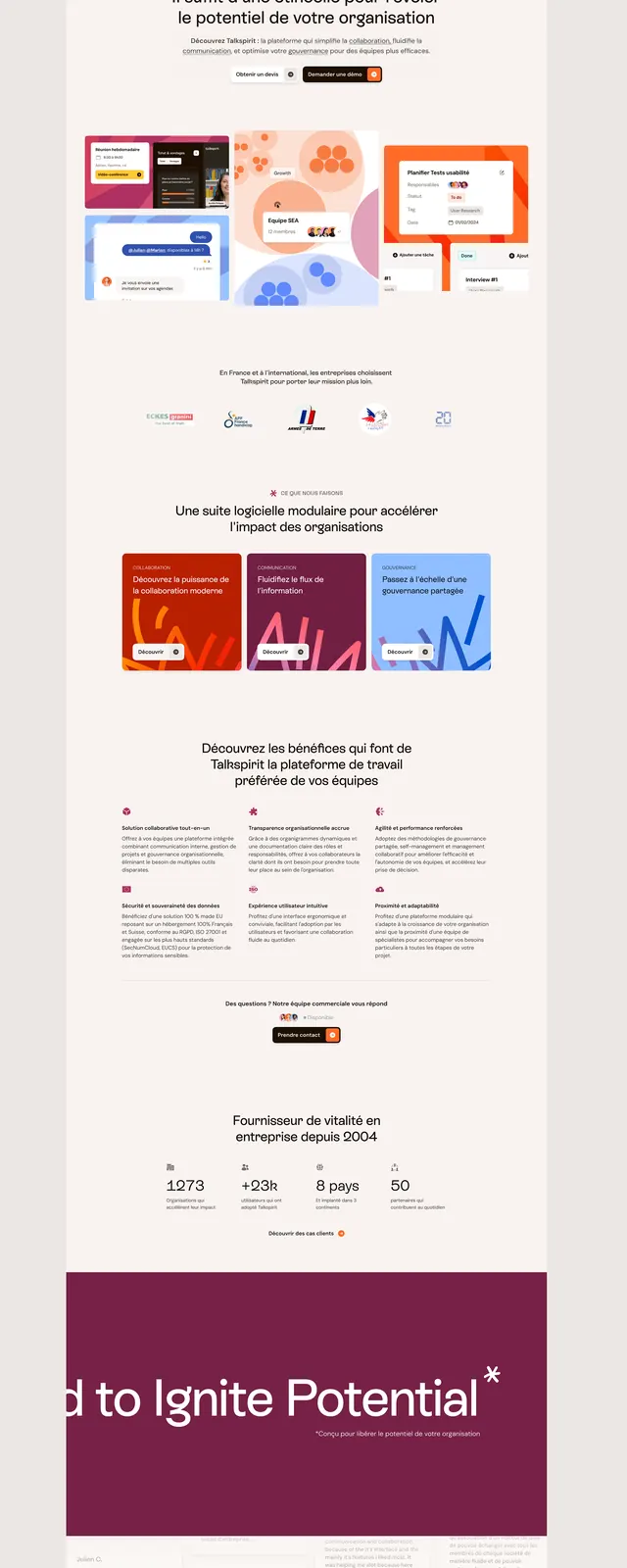
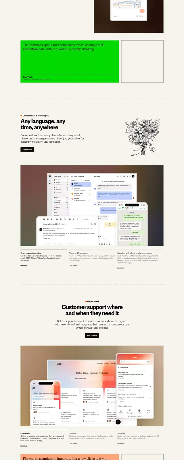
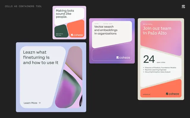
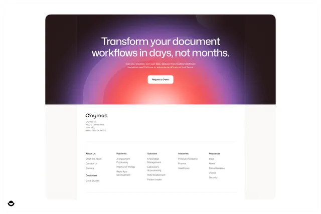
Landing page section with radial purple-to-pink gradient burst behind headline and demo-request button, followed by white footer with multi-column navigation.
Summary
Landing page with radial purple-to-pink gradient burst framing a headline and primary cta, plus a clean five-column footer navigation grid.
Visual description
Upper half: dark background with a radial gradient emanating from center, starting deep purple at edges, transitioning through magenta, pink, and warm orange-coral toward the center bright white. Centered over this gradient is a two-line white headline "Transform your document workflows in days, not months." Below is small grey supporting copy, then a white rounded-rectangle button with dark text "Request a Demo". Lower half: white background with a two-column layout containing stacked footer links. Left side has sections labeled "About Us" (Meet Our Team, Contact Us, Careers, Customers, Case Studies), "Platforms" (AI Document Processing, Internet of Things, Rapid API, Development). Right side lists "Solutions", "Industries" (Precision Medicine, Pharma, Healthcare), and "Resources". A small circular logo sits at bottom left. The entire layout respects generous vertical rhythm and negative space.
Key takeaway
The radial gradient creates natural focus and energy without animation: the eye lands on the center bright spot and follows the "blast" outward, naturally reading the headline before the supporting text. The two-button approach is eliminated here (single clear cta), which reduces cognitive load. The white footer against the dark hero section creates a natural page break, and the five-column nav structure fits more links than a horizontal menu while remaining scannable.
Reuse notes
Strong for B2B SaaS landing pages targeting workflow/productivity verticals. The warm radial gradient (purple to pink to coral) reads as innovative and trustworthy rather than cold. The demo-request button pattern is standard for sales-driven pages. The footer layout scales well to mobile if compressed to a single column. Works best when the headline and cta are genuinely compelling, as the gradient draws so much attention.