Preview image. Unlock full-res
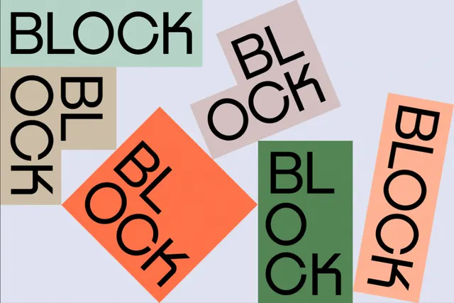
Scattered rotated blocks of uppercase sans-serif text spelling 'BLOCK' in a geometric collage with earthy and saturated accent colors.
Summary
A typographic branding system using rotated rectangular blocks, each containing uppercase 'BLOCK' in varying rotations and sizes, arranged asymmetrically across a pale background.
Visual description
A pale lavender background holds six to eight rectangular blocks of varying sizes, each rotated to a different angle, painted with sage green, peach-orange, warm tan, or pale gray. Each block is stamped with the word 'BLOCK' in bold, uppercase sans-serif (likely a geometric sans), with the type color shifting between black, white, and muted tones to maintain contrast against its background block. The overall rhythm is organic and scattered despite the strict geometry of each element, creating visual tension between order and spontaneity.
Key takeaway
Rotating identical type units at different angles and scales creates dynamic visual rhythm while staying grid-aligned conceptually. The limited but deliberately contrasted color palette (sage green, peach, neutral) feels contemporary corporate. Each block's color and type color pair maintain clear hierarchy; reversing type color per block (dark type on light, light on dark) improves legibility across the palette without visual chaos.
Reuse notes
Ideal for creative agency branding, design studio identity systems, or modular campaign templates. Works strongest when the repeated element (here, type) is bold enough to read at multiple scales and rotations. Not suitable for content-heavy layouts; best as a hero or campaign visual.