Preview image. Unlock full-res
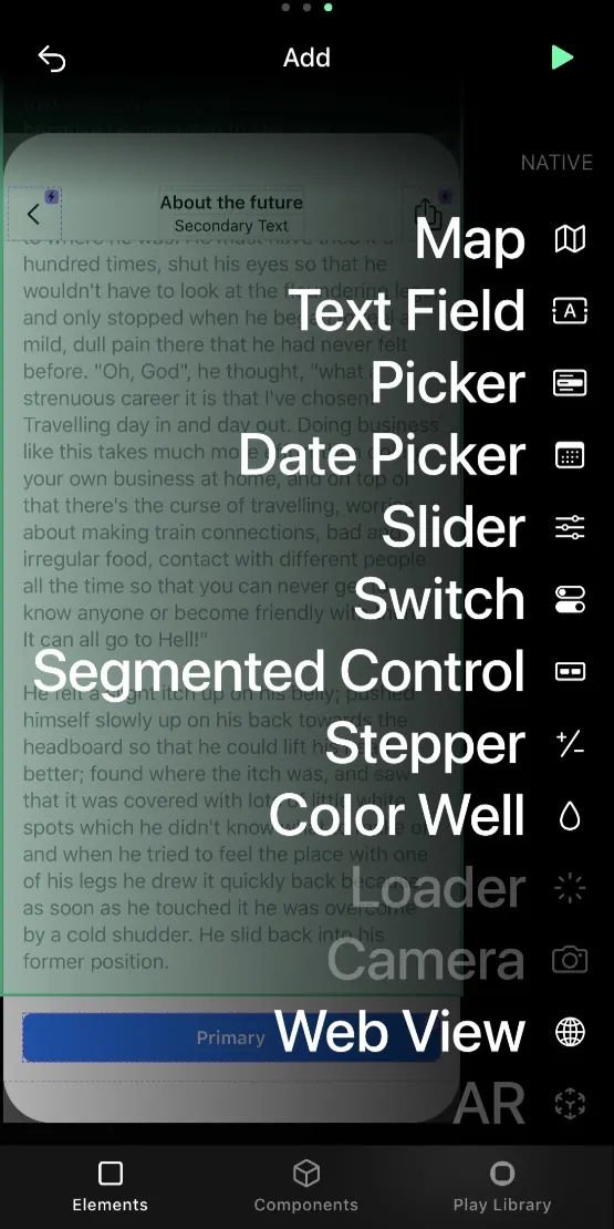
A dark-mode mobile UI showing a scrollable list of UI components (Map, Text Field, Date Picker, Slider, Color Picker, etc.) with a highlighted Web View element at the bottom.
Summary
A mobile component picker interface with a dark background displaying a scrollable list of UI element types, including Map, Text Field, Date Picker, Slider, and others, with Web View highlighted in blue at the bottom.
Visual description
Mobile interface with pure black background and dark charcoal-gray text. The UI displays a vertically scrollable list of component names, each positioned as a clean text label. At the bottom of the visible list, "Web View" appears with a bright blue background highlight, indicating selection or emphasis. The list uses minimal spacing, tight typographic alignment, and a monochrome palette of dark neutrals with strategic blue accent. The design prioritizes information density and functional clarity with no decorative elements or icons visible.
Key takeaway
A clean, dark-mode functional interface that uses color highlight (bright blue) sparingly to draw attention to active states, making selection immediately clear. The minimal, text-forward approach keeps the interface focused and readable in developer or technical contexts. Tight typographic hierarchy and consistent spacing create order without visual noise.
Reuse notes
Ideal for developer tools, design system pickers, or any technical interface where users need to scan a long list quickly. The dark mode reduces eye strain during extended use, and the single color accent technique is highly reusable across different UI categories. Best paired with sans-serif display fonts and spaces where functionality matters more than visual embellishment.