Preview image. Unlock full-res
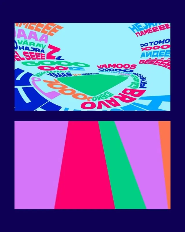
A hyperkinetic typographic composition layered with overlapping, variously angled sans-serif and display type in neon and pastel hues on a light cyan ground, paired with a lower geometric color-field section.
Summary
A hyperkinetic typographic composition layered with overlapping, variously angled sans-serif and display type in neon and pastel hues on a light cyan ground, paired with a lower geometric color-field section.
Visual description
Upper half: dense, chaotic typographic landscape with glossy sans-serif and display letterforms (white, magenta, cyan, orange, yellow) set at multiple angles across a light cyan backdrop. Text is legible as individual words but collectively unreadable, creating pure visual noise and movement. Lower half: three angled geometric planes in pastel magenta, bright hot pink, neon lime-green, and orange, meeting at diagonal edges, evoking perspective and depth without representational imagery. The entire composition sits on a deep navy ground, framing the bright central content.
Key takeaway
The deliberate clash between legible individual typography and overall illegibility as a compositional strategy. The color sequencing from cool (cyan, purple) to warm (pink, orange, green) in separate zones. The use of geometric planes at the bottom to provide visual pause and structural weight after the busy typographic top.
Reuse notes
Ideal for music posters, festival promotions, or youth-culture branding where chaos signals energy rather than confusion. Works best at large scale to maintain type legibility within the overall noise. The neon-on-cyan palette limits contexts but anchors the y2k aesthetic powerfully.