Preview image. Unlock full-res
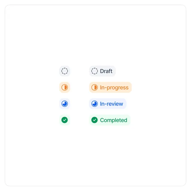
Four workflow status states (Draft, In-progress, In-review, Completed) represented by color-coded icons paired with text labels in a vertical list.
Summary
A vertical stack of four process stages, each with a left-aligned circular icon and right-aligned descriptive text, using cool and warm accent colors to differentiate states.
Visual description
Clean, vertical layout with four distinct status rows evenly spaced on a white background with rounded-corner container border. Each row pairs a colored circular icon (left) with a light-tinted background pill and text label (right). Draft state uses a dashed gray circle icon with gray pill background. In-progress uses a filled orange circle with orange icon inside and warm peachy-orange pill background. In-review uses a blue checkmark circle with blue icon and light blue pill background. Completed uses a green checkmark circle with green icon and light mint-green pill background. All labels use left-aligned sans-serif type, roughly 16px. Generous vertical spacing between rows (roughly 40px) maintains clarity.
Key takeaway
Color-coded icon + background combo quickly communicates state without needing text alone. The paired circular icon on the left, rectangular pill label on the right creates a balanced asymmetric layout. Dashed icons for inactive states and filled for active/completed states signals interactivity and progress status instantly.
Reuse notes
Standard pattern for task-management, project-tracking, or multi-step workflow UIs. Works well in software dashboards, form progress indicators, or approval workflows. Can be adapted to horizontal or nested layouts. The pastel background colors reduce intensity while maintaining color identity; pair with darker text for accessibility.