Preview image. Unlock full-res
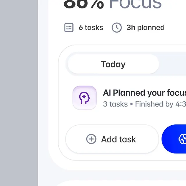
A clean productivity dashboard with 88% focus-completion progress, task list, AI-guided planning, and inline action affordances in a minimal palette of white, blue, and lavender.
Summary
A mobile productivity interface showing a large progress ring (88% focus), summary metrics (6 tasks, 3 hours planned), and a card-based action area with AI-guided scheduling and task-add buttons.
Visual description
A vertical mobile screen on a light gray background. Top third: a large circular progress ring (88% complete, labeled "Focus"), with two submetrics below (6 tasks icon, 3h planned clock icon). Middle section: a rounded white card titled "Today" with nested content. Inside: a compact AI-planning card (small rounded icon in soft-purple with spark symbol) showing "AI Planned your focus" plus task count and deadline ("3 tasks, Finished by 4:30"). Below: an outlined "Add task" button with plus icon, anchored to the card's lower edge. Bottom right: a bright blue call-to-action button (partially visible, likely a trigger). All type is sans-serif; buttons are full-width or pill-shaped with subtle borders or fills. The color palette is restrained: mostly white and light gray, with cool blue for primary actions and soft purple (lavender) for AI/secondary features.
Key takeaway
The large circular progress metric as a scan-friendly focal point above task-list granularity. The nested card pattern (Today card > AI suggestion > button) creates clear information hierarchy and progressive disclosure. The soft purple as an AI-specific signal color is intuitive without competing with primary blue.
Reuse notes
Strong template for any productivity or task-management app, especially ones with AI-assisted scheduling. The calm palette suits focus-oriented contexts (wellness, meditation, work sprints). The nested card approach handles complexity well at mobile scale. The large metric may not scale as effectively on desktop (consider a sidebar treatment); the blue CTA seems cut off, so verify the full button layout in context.