Preview image. Unlock full-res
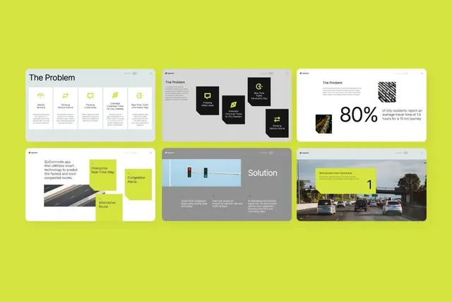
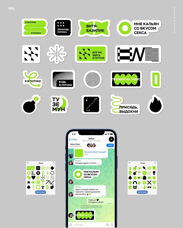
Modular flat UI kit with lime-green sticker-style components and line-art icons on a gray background, demonstrated in a messaging app mockup.
Summary
Flat, high-contrast design system using lime-green sticker-style rounded-rectangle cards with black line-art icons, showcased both as a loose component grid and live in a messaging app.
Visual description
Grid of lime-green and black components (top two-thirds) arranged on a medium gray background: rounded-rectangle cards with white text labels in Cyrillic script, geometric icons (patterns, dots, stripes), line-art illustrations, and solid-color circle badges. Sticker-style rounded corners and 2-3px black outlines define each component. Bottom third shows a phone mockup with the same design language applied to a chat interface: green pill badges, black line-art avatars, chat bubbles, and side-panel UI patterns, all maintaining the consistent high-contrast lime/black/white/gray palette.
Key takeaway
The sticker aesthetic (rounded corners + border thickness) creates visual warmth and playfulness without sacrificing clarity. The structured grid layout makes component discovery obvious, and the live mobile mockup proof-of-concept at bottom grounds the system in a real use case.
Reuse notes
Ideal for consumer apps, community or messaging platforms aiming for friendly, energetic visual identity without corporate polish. The lime-green accent demands dark neutral backgrounds; would lose contrast on light. Scale icons carefully when reducing to mobile.