Preview image. Unlock full-res
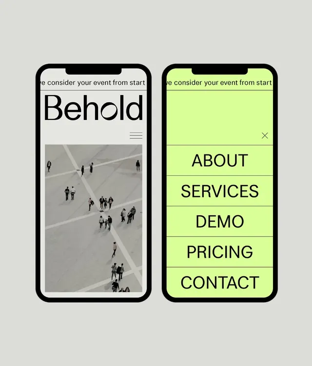
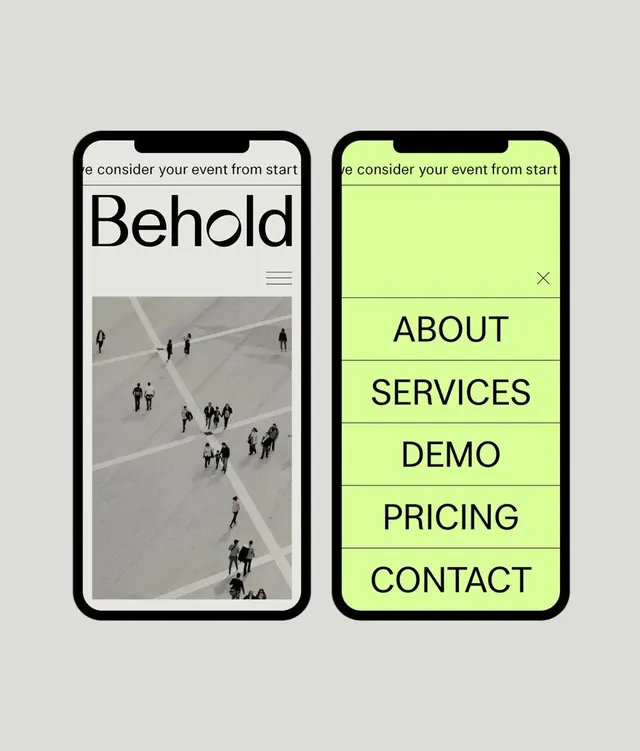
Two side-by-side iPhone mockups showing a minimal app with a large hero image on the left and a neon-green full-screen menu on the right.
Summary
Two iPhone mockups side by side: a neutral screen showing a hero image with the word "Behold," and a neon-green full-screen menu with navigation items stacked vertically.
Visual description
Gray background with two thick-bordered iPhone mockups. Left screen features a light background with "Behold" as a display headline, a hamburger menu icon, and a large photograph of people on a plaza walkway. Right screen is filled with neon-green (lime) background and displays navigation items in black sans-serif stacked vertically: ABOUT, SERVICES, DEMO, PRICING, CONTACT. A close X button is positioned top-right. Both phones have notches and rounded corners.
Key takeaway
A bold, high-contrast menu strategy using bright accent color to signal navigation mode. Stacked menu items create a clear hierarchy and are easy to tap on mobile. The split mockup effectively shows before-and-after states without needing animation.
Reuse notes
Works well for event or service-based apps where a full-screen overlay menu needs visual clarity. The neon color is eye-catching but can feel trendy; tone it down for b2b or corporate contexts. The vertical stacking is mobile-native and familiar to users of popular mapping and lifestyle apps.