Preview image. Unlock full-res
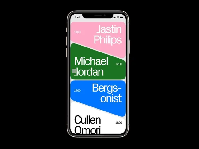
Mobile schedule interface using bold color blocking and large sans-serif names to present a time-ordered event list.
Summary
A mobile schedule screen presenting four timed events using full-width color-blocked cards with large white typography and angled dividers between sections.
Visual description
A smartphone screen displaying a vertical event list. Each event occupies a full-width horizontal band filled with a single bold color: pale pink at top, kelly green second, bright blue third, white at bottom. Names appear in large, left-aligned sans-serif (Jastin Philips, Michael Jordan, Bergsonist, Cullen Omori). Times display in small lighter text to the right of each name (13:00, 14:00, 15:00, 16:00). Between each color block is a subtle angled divider creating a dynamic rhythm. The layout prioritizes typography and color over icons or imagery. White status bar at very top with time, signal, battery indicators. High contrast ratio between text and each color block ensures legibility. No ornamental elements, just text and color.
Key takeaway
Color blocking as primary visual hierarchy and information separation tool. The angled dividers add dynamic interest without decorative complexity. Large sans-serif names make the primary information (who, when) instantly scannable. Triadic color palette (pink, green, blue) signals distinct events while remaining balanced. This approach scales well to longer lists because color contrast keeps each item separable.
Reuse notes
Strong pattern for event apps, class schedules, meeting rosters, or any time-ordered list where visual distinction per item matters. Works especially well on mobile where deep information hierarchies fail. The color-per-entry approach risks confusion if more than 5-6 items are present, so reserve for shorter lists or implement scroll pagination. Note the angled cuts work best with full-width layouts; they may feel cramped in narrow sidebars.