Preview image. Unlock full-res
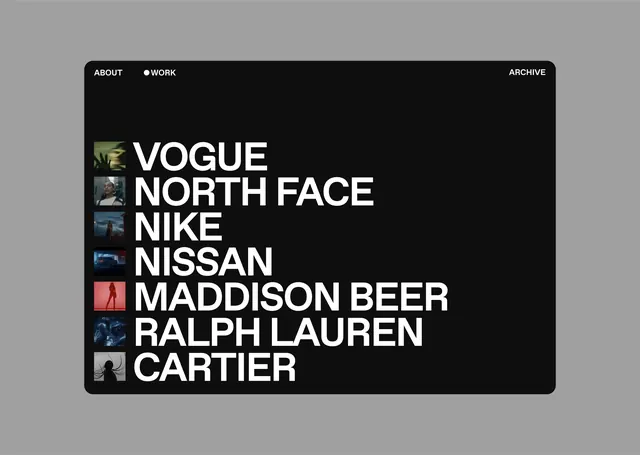
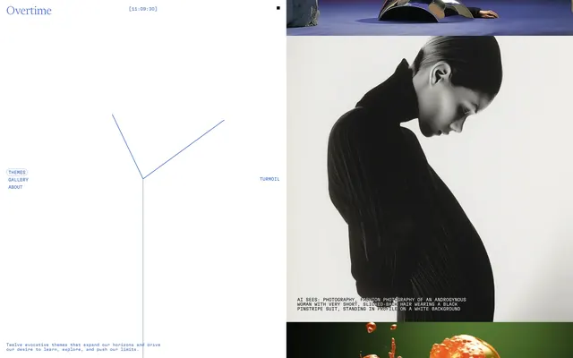
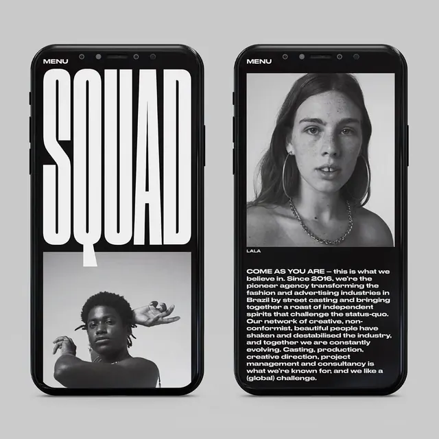
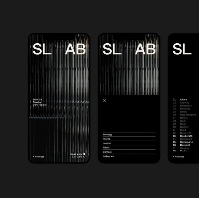
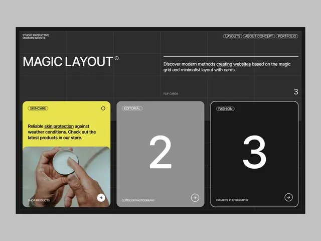
A portfolio interface with a dark background, numbered grid cards showcasing product photography, and a yellow accent highlight on the first item.
Summary
A dark-mode portfolio interface using a numbered grid to organize product images, with one accent card highlighted in bright yellow to draw attention to a featured project.
Visual description
Dark charcoal background with "Magic Layout" header in white type at top. Below, a horizontal row of three content cards arranged in a grid: Card 1 (left, yellow background) shows a close-up product photograph (hand holding ceramic vessel) with descriptive text overlay; Cards 2 and 3 (gray backgrounds) display large white numerals with minimal text below and subtle icons. The layout emphasizes stark contrast and clear information hierarchy through size, color, and spacing. All text is sans-serif, tight, and uppercase or minimal-case. No clutter, ample breathing room around each element.
Key takeaway
The numbered card system creates natural scanning order and can serve as a visual taxonomy. Yellow accent card on a monochrome grid is an economy of color that still reads as emphasis. Balancing product photography with purely typographic cards (numbers) breaks monotony while keeping the layout severe.
Reuse notes
Works for portfolio, case-study grids, or any gallery requiring both visual samples and categorical labels. The dark background suits work that benefits from premium, high-contrast presentation. Adapt the feature card color to match brand accent; works well for agency or creative service sites.