Preview image. Unlock full-res
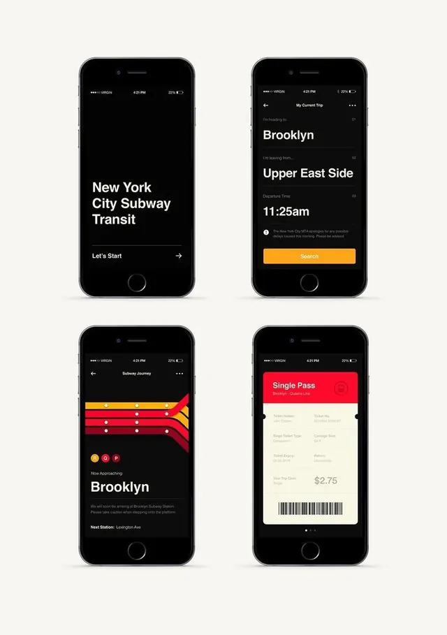
Four dark-mode transit ticketing screens using oversized sans-serif headers, diagonal wavy ribbon graphics, bright orange search buttons, and layered micro-interactions to present trip data, stops, and fare breakdown.
Summary
Four dark-mode transit ticketing screens using oversized sans-serif headers, diagonal wavy ribbon graphics, bright orange search buttons, and layered micro-interactions to present trip data, stops, and fare breakdown.
Visual description
Top left: black screen with oversized white "New York City Subway Transit" headline and "Let's Start" link with arrow. Top right: destination-selection screen listing "Brooklyn" and "Upper East Side" with "Departure Time" 11:25am and orange search button. Bottom left: journey map with diagonal ribbons (wavy red, yellow, orange) overlapping vertically to show stops approaching Brooklyn, with social-media-style engagement icons (emoji reactions, pins, links) and next-station callout. Bottom right: bright red "Single Pass" ticket card on cream background showing ticket details (Rider Number, Card Type, etc.), barcode, and fare ($2.75). All screens share black navigation headers, sans-serif typography in white, and consistent orange accent for primary actions. Diagonal composition and wavy forms add movement to otherwise flat card layouts.
Key takeaway
Diagonal wavy ribbons (not straight lines or solid fills) convey journey and flow without requiring custom animation. Oversized headline type (first screen) combined with minimal CTA creates powerful micro-interaction sequencing. Orange brightness on pure black ensures CTA clarity without diminishing dark-mode cohesion. Barcode + ticket aesthetics ground transactional moments in tactile, familiar paper-ticket design language.
Reuse notes
Essential for travel, transportation, and booking apps where route visualization and ticket issuance are core. Pairs well with simple geography / directional metaphors. The diagonal ribbon pattern works for multi-leg journeys, timelines, or any narrative sequence. Orange-on-black CTA is exceptionally strong for conversion on dark surfaces; test only if your brand permits warm accents.