Preview image. Unlock full-res
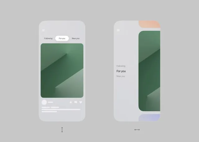
Two mobile feed screens using soft green-to-tan diagonals and tabbed navigation to organize content, with soft peach accent caps above the scrollable areas.
Summary
Two mobile feed screens using soft green-to-tan diagonals and tabbed navigation (Following, For you, Near you) to organize content, with soft peach accent caps above the scrollable areas.
Visual description
Left screen: three-option tab bar sits above a tall card filled with a diagonal soft green gradient (light upper left to darker lower right), with white icons and text below for interactions. Right screen shows the same layout vertically stretched, taller card with a peach-toned accent rectangle peeking from the top and a pastel purple rectangle at the bottom edge. Both screens sit on a beige-gray background with soft rounded corners on content areas, pale gray interaction controls (heart, star, share icons) subtly rendered at the bottom of each card. Typography is clean sans-serif, minimal and spacious.
Key takeaway
The diagonal gradient fill (not horizontal or vertical) creates dynamic depth on a simple rectangular card without added imagery. Mixing warm (peach, tan) and cool (green, purple) accent rectangles across screens suggests a cohesive palette. Soft, muted color tones keep the design calm and premium despite minimal contrast.
Reuse notes
Strong for content-feed apps (social, news, marketplace, curation) where large immersive cards need soft visual polish. Works well for apps targeting calm, introspective users. Pair with spacious whitespace and light gestures. Avoid on high-contrast or urgent-action interfaces.