Preview image. Unlock full-res
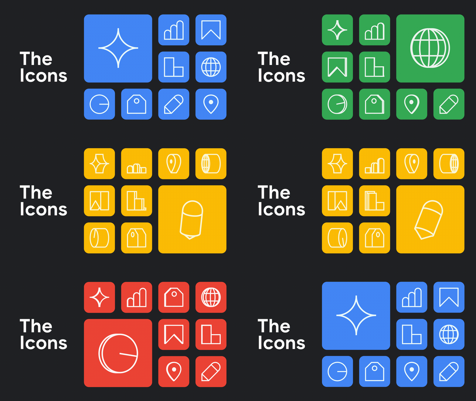
Animated icon system from Google Marketing Live 2024 with geometric outlines, minimal line weight, and smooth motion transitions between states.
Summary
Animated icon system from Google's marketing event featuring geometric line-drawn icons with smooth motion transitions and minimal stroke weight.
Visual description
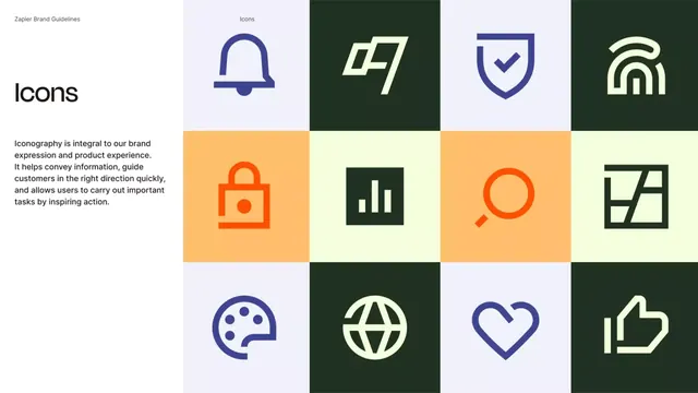
Motion graphic showing a series of outlined icons in a structured grid, each constructed from simple geometric shapes and thin consistent line weight. Icons transition smoothly between states in the animation, demonstrating different interaction or loading states. The color palette is minimal: dark background (near-black), with golden yellow, soft yellow, brown, and muted accent colors appearing on individual icons. Each icon is centered within its own square cell, maintaining balanced whitespace and clear legibility across sizes.
Key takeaway
The consistent line weight and geometric construction method (easily scalable to any size); the subtle smooth motion adding life without distraction; the color accent placement strategy (single pop color per icon rather than full palette per state); the grid-based modular structure enabling easy expansion.
Reuse notes
Excellent reference for building scalable icon systems for apps, interfaces, or design systems. The animated approach is particularly strong for loading states, progress indicators, or tutorial flows. The minimal color-per-icon strategy keeps the system coherent while allowing visual variety. Works across digital products and brand motion design.