Preview image. Unlock full-res
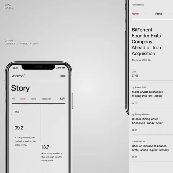
Financial dashboard mixing a metrics-heavy mobile screen (with tabbed navigation and data visualization) and a clean web publication sidebar listing crypto news headlines.
Summary
A split-screen layout combining a mobile financial metrics interface (with tabbed navigation and large data callouts) on the left and a clean column-based news feed on the right.
Visual description
Left: A mobile screen mockup (labeled "veermo") displaying a "Story" view with three horizontal tabs (We, Story, Team, Vacancies). Below is a numbered data section: "2012" above "09.2" and "13.7", each metric followed by a single-sentence explanation of what it represents. The layout uses generous whitespace around each element and employs a clear left-aligned hierarchy. Right: A news publication column with "Publications" header, then two tabbed sections (News, Press), followed by a vertical feed of article headlines with publication dates on the right margin. Each entry is separated by a horizontal rule. The overall palette is monochromatic (white, light gray, mid-gray, charcoal), with sans-serif typography throughout. No color accents.
Key takeaway
The left screen's metrics layout is information-dense yet uncluttered: each number is anchored to a small-cap label and a supporting sentence. The right side's justified, columnar news feed with right-aligned dates is a classic editorial grid. Together, they show how to mix dense data (mobile) with readable prose (web) in one coherent aesthetic.
Reuse notes
Ideal for fintech or crypto platforms that need to present KPIs alongside market news. The monochromatic palette conveys seriousness and trust. The tabbed mobile interface works well for filtering between different story types. The news feed is suitable for dashboards that include both primary data and supporting editorial content. Works best when actual metrics and headlines are compelling; the whitespace needs strong content to justify it.