Preview image. Unlock full-res
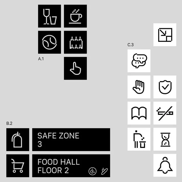
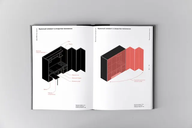
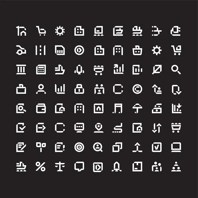
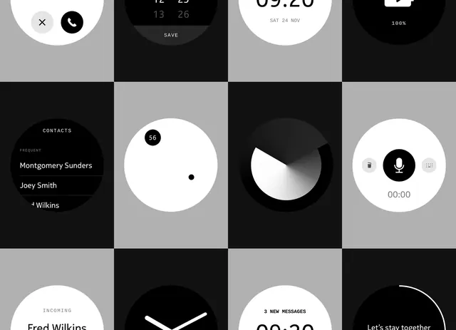
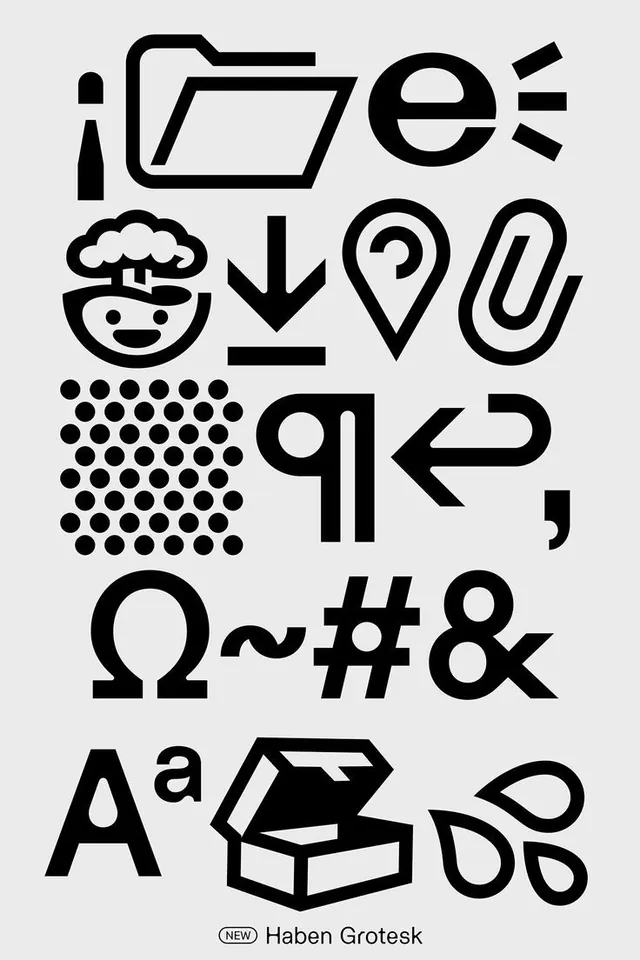
Dense type specimen grid displaying custom line-drawn glyphs and symbols in a consistent monochromatic style, demonstrating expressive character set variation and icon design language.
Summary
A type specimen sheet for Haben Grotesk showing a dense grid of custom line-drawn glyphs, symbols, and icon variations in clean black strokes on light background.
Visual description
Vertical layout on light gray background with 30+ custom glyphs in black line art arranged in loose rows. Icons include folder, person with shine rays, cloud face with expression, downward arrow, question mark in circle, paperclip, 6x6 dot grid, left arrow with line, abstract symbols, Greek omega, tildes and ampersands, capital letter A, box-and-tear shape, and three tear drops. All executed with consistent medium-weight strokes, rounded joints, and clean geometric construction. Font name "Haben Grotesk" label at bottom in small sans-serif. Universal visual language emphasizing versatility and expressive mark-making within a minimal palette.
Key takeaway
The layering of utility icons (file, mail) with expressive characters (faces, gestures) in one cohesive set, demonstrating that a typeface's symbol layer can carry personality. The consistent stroke weight and joint treatment across diverse shapes creates system coherence without appearing sterile. The density of the layout proves concept without becoming visual chaos.
Reuse notes
Reference for designing icon systems within or alongside custom typefaces. The systematic approach scales well for product design systems, educational apps, and content platforms. Works equally for print specimens and digital component libraries. Best when paired with actual type samples to show character-and-icon co-design.