Preview image. Unlock full-res
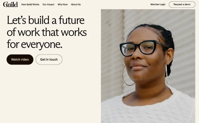
A split-screen landing page with left-aligned headline 'Let's build a future of work that works for everyone' and right-side portrait of a person, using cream background and warm earth tones.
Summary
A welcoming SaaS landing page using a left-aligned headline, two-button CTA group, and full-height portrait on the right, anchored by a cream background and warm neutral palette.
Visual description
Asymmetrical split-screen layout: left column contains navigation bar with the "Guild" logo, headline in large black type reading "Let's build a future of work that works for everyone," and two CTAs ("Start free" and "Get in touch") stacked vertically below. Right column features a full-height portrait photograph of a person with glasses and natural expression against a soft off-white background. Cream-colored page background (#F8F2E9) unifies both sections. Sans-serif typeface throughout navigation and CTAs. The subtle warm gray (#8F735F) appears in accents. High contrast between black text and light background maximizes readability.
Key takeaway
The asymmetric split balances text-heavy messaging with visual humanity via portrait. Two CTAs (one primary, one secondary) provide options without overwhelming. Warm, inclusive color palette signals approachability while maintaining corporate legitimacy. The full-bleed portrait on the right adds depth without requiring elaborate illustration.
Reuse notes
Ideal for HR tech, workplace culture platforms, or inclusive-messaging B2B SaaS. The warm palette conveys approachability better than cool grays. Portrait photography makes abstractions like "future of work" feel personal. Avoid if brand identity demands higher visual complexity or playfulness.