Preview image. Unlock full-res
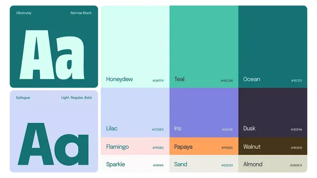
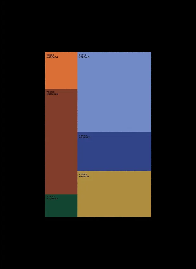
A color palette specimen organized as a grid of labeled swatches, pairing warm oranges and rusts against cool blues and muted greens with hex codes visible.
Summary
A palette reference showcasing contrasting warm and cool colors arranged as a rectangular swatch grid with embedded hex codes for each hue.
Visual description
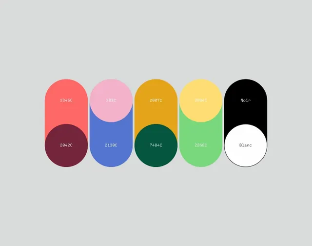
Black background with a modular grid of colored swatches: an orange-rust column on the left spans most of the height; a periwinkle-to-navy column dominates the right; a golden-yellow rectangle anchors the lower right; a teal-green accent sits at the bottom left. Each swatch displays its hex code in white sans-serif and monospace type, creating a functional reference tool. The contrast between warm (orange, rust, yellow) and cool (blue, teal) families is deliberate and pronounced.
Key takeaway
The direct pairing of chromatic opposites (warm rust-orange vs cool periwinkle-blue) to demonstrate harmonic tension. The grid structure with labeled swatches as a reusable palette-reference format. The use of monospace hex labels as a dual-purpose design and engineering artifact.
Reuse notes
Ideal for design-system documentation, brand-palette specs, or color-theory presentations. Works as a stand-alone reference or as a component within a larger style guide. The contrast structure reads well for accessibility audits.