Preview image. Unlock full-res
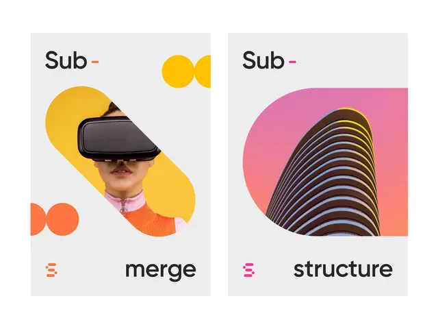
Paired brand concept screens for Sub showing warm geometric abstraction and minimalist icon system with VR hardware and wavy line-work.
Summary
Two brand-system compositions labeled "Sub-merge" and "Sub-structure," each pairing abstract geometric shapes with product imagery and a minimalist icon suite in warm orange, yellow, and pink tones.
Visual description
Left panel "Sub-merge" features a person wearing a black VR headset against overlapping matte-yellow and bright-orange circles, with a yellow double-circle element above. The right panel "Sub-structure" shows concentric black and pastel-blue striped wave forms overlapping a bright pink rectangular background. Both panels use a light gray canvas. Brand marks appear as stacked horizontal lines in the matching accent colors (orange left, magenta right). Clean sans-serif type in dark gray anchors each composition; colored accent dashes between the brand name and section label emphasize the color coding.
Key takeaway
The use of bold, non-identical geometric shapes per panel as a visual differentiator within a unified identity system. The color-coding strategy (orange for one concept, magenta for another) creates instant visual distinction while maintaining family cohesion. Overlapping translucent shapes and photography/product mockup behind geometric forms creates visual depth within a flat, icon-driven system.
Reuse notes
Strong reference for brand identity systems that need to convey multiple product tiers or conceptual branches. Works well for tech, VR, or consumer apps where you want warmth and approachability. The two-panel layout is ideal for showcasing before/after, feature vs. feature, or tier vs. tier comparisons in a promotional or case-study context.