Preview image. Unlock full-res
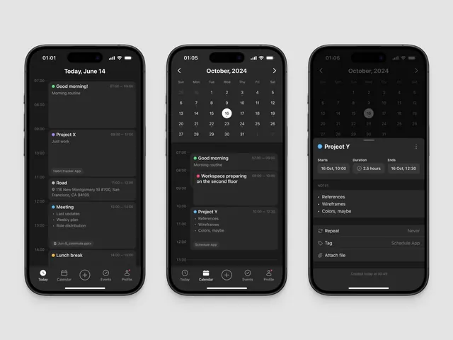
A three-screen dark-mode mobile app mockup showing a daily schedule (Today view), calendar month view, and event details panel, each displayed on an iPhone with status bar and home indicator.
Summary
Three iPhone screens displaying a dark-mode scheduling app: a time-blocked daily view, an October 2024 calendar grid, and a detailed event panel showing "Project Y" duration and notes, each with a bottom tab navigation bar.
Visual description
Three iPhone mockups arranged horizontally on a gray background, each showing distinct screens within the same app. Left phone (01:01 timestamp) displays a vertical timeline for Today, June 14, with multiple time blocks: "Good morning! Morning routine" (7am-9am, green dot), "Project X Just work" (9am-11am, purple dot), "Road" at 116 New Montgomery St (11am-12pm with location pin), "Meeting" with bullet points (12pm-2pm, blue dot), and "Lunch break" (2pm-3pm, orange dot). All text is light gray on a dark background with small colored dots serving as event type indicators. The bottom navigation shows five icons: Today (active), Calendar, Events (+), Checkmark, and Profile.
Center phone (01:05) shows an October 2024 calendar view with an 8-column grid (Sun-Sat days plus overflow). The 16th is circled (today marker) in white. Below the calendar at 10am is "Project Y References Wireframes Colors maybe" with a blue dot indicator. The calendar month has clear numeric contrast against the dark background.
Right phone (01:06) displays an event detail panel for "Project Y" with "Starts 16 Oct, 10:00", "Duration 2.5 hours" (with a clock icon), "Ends 16 Oct, 12:30", and a NOTES section listing "References, Wireframes, Colors, maybe". Below that are toggle options for "Repeat" (set to "Never") and "Tag" (showing "Schedule App"), plus an "Attach file" option. Bottom timestamp shows "Created today at 00:49".
All screens use a monochromatic palette of blacks, dark grays, light grays, and near-white text with minimal color accents (green, purple, orange, blue dots for categorical differentiation). Consistent sans-serif typeface throughout with clear typographic hierarchy and generous whitespace around interactive elements.
Key takeaway
The color-dot system for event categorization. Rather than colored cards or backgrounds, each event gets a small colored circle that maintains the calm, dark aesthetic while providing instant scanability. The three-screen progression demonstrates a clear information hierarchy: overview (timeline), browse (calendar), and detail (panel), avoiding cognitive overload. The time-blocking layout with left-aligned timeline is scannable and space-efficient. The generous padding and monochromatic palette make the interface feel premium and reduce eye strain in dark mode.
Reuse notes
Excellent reference for SaaS productivity tools, project-management apps, and calendar/scheduling interfaces. The dark theme is ideal for power-user workflows and extends screen battery life on OLED devices. The color-coded dot system works at any app scale without requiring full-color treatment. The three-column mockup format clearly communicates user flow and feature depth, making it suitable for app store screenshots or pitch decks. The minimal accent color use (just enough contrast for interactive elements) signals a professional, business-focused app rather than a consumer toy.