Preview image. Unlock full-res
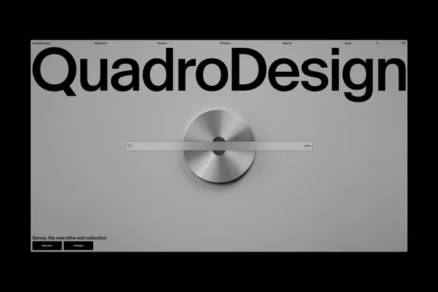
Clean light gray website with oversized brand wordmark, horizontal navigation and a prominent centered brushed-metal circular control with slider element promoting a new collection.
Summary
Minimalist website homepage for QuadroDesign featuring a large centered logo, simple top navigation and an interactive-looking brushed metal dial element over a light background.
Visual description
Very light gray full-bleed background. Top thin nav bar with "QuadroDesign" in large bold black sans-serif on left, followed by links Bathroom Kitchen Filtration View all Shop and icons. Dominating center: a large circular brushed stainless steel disc with a thin horizontal metallic bar slider passing through its center, with a small search input "Q |" on left of bar and "CLOSE" button on right. Bottom left footer text "Sense, the new infra-red collection" above two small black rectangular buttons "Read more" and "Catalogue".
Key takeaway
The oversized wordmark paired with a single striking product-like interactive element (the dial) creates a focused, high-end brand presentation with lots of negative space.
Reuse notes
Excellent reference for premium product or design brand sites. Works for industrial, bathroom or hardware brands. The light monochrome and large type make strong first impression; the central element draws attention without clutter.